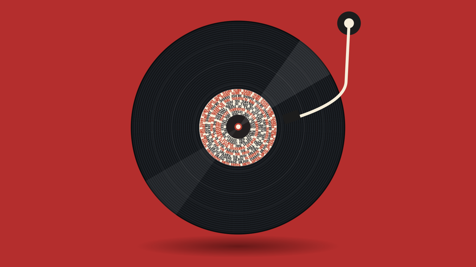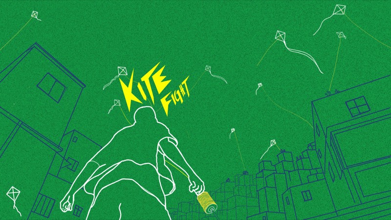
The final animation · hover to play the nine moves
SHUVO
Visual Identity & Motion
Identity / Motion Design · 2026
The project
This project explores the evolution of my personal visual identity, from early logo concepts to the final approved design created in Adobe Illustrator. I developed the original logo concept, composition, color system, and motion direction.
Using AI-assisted experimentation, I explored ways to bring my design into motion while preserving the structure and visual language of my final Illustrator artwork.
- Concept & creative direction
- Shuvo Miah
- Logo design & visual identity
- Shuvo Miah
- Final Illustrator layout & color system
- Shuvo Miah
- Motion concept & direction
- Shuvo Miah
- AI-assisted animation experimentation
- Developed using AI tools based on my original Illustrator artwork and creative direction
Sketches
Rough sketches + ideas
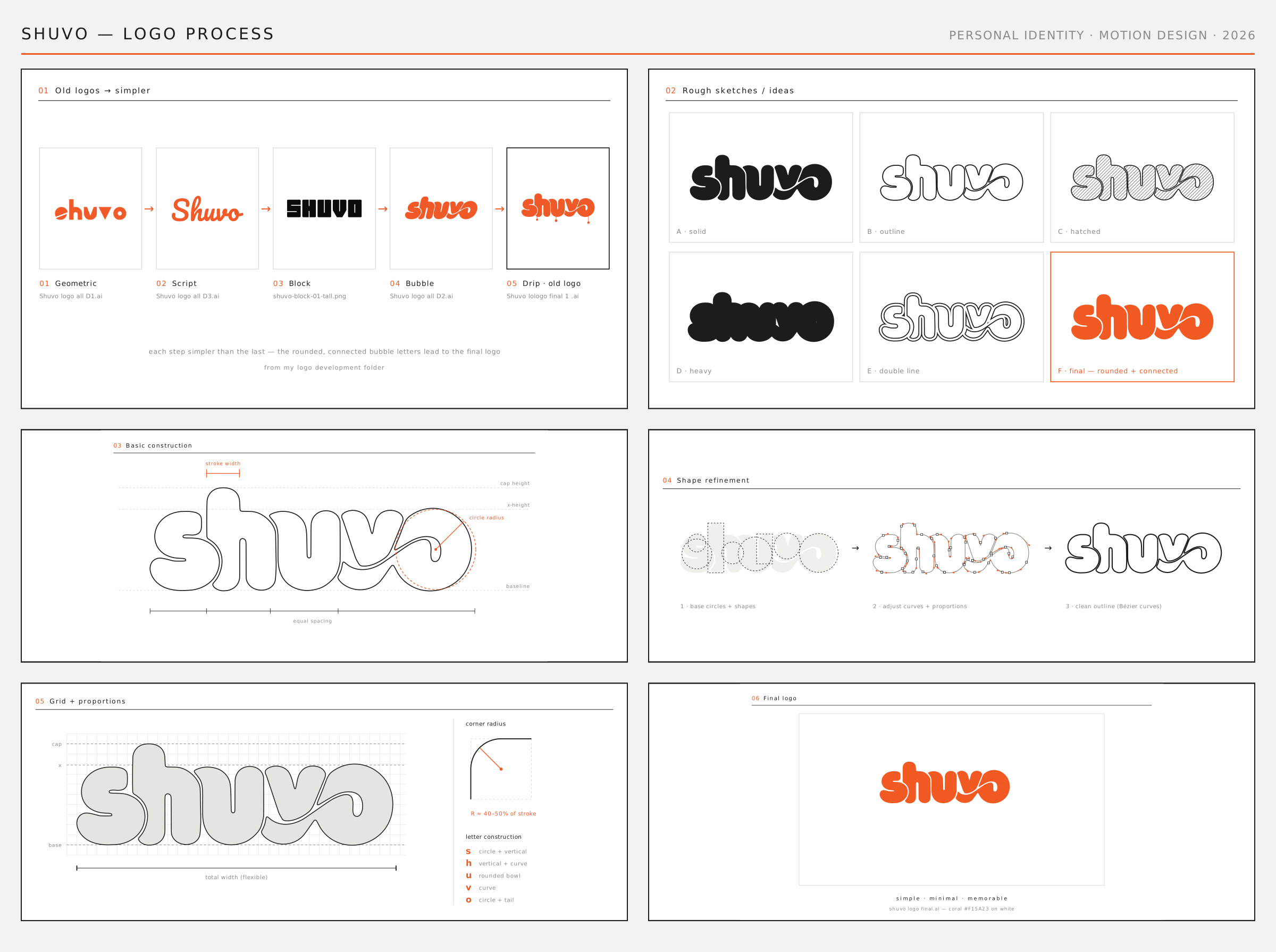
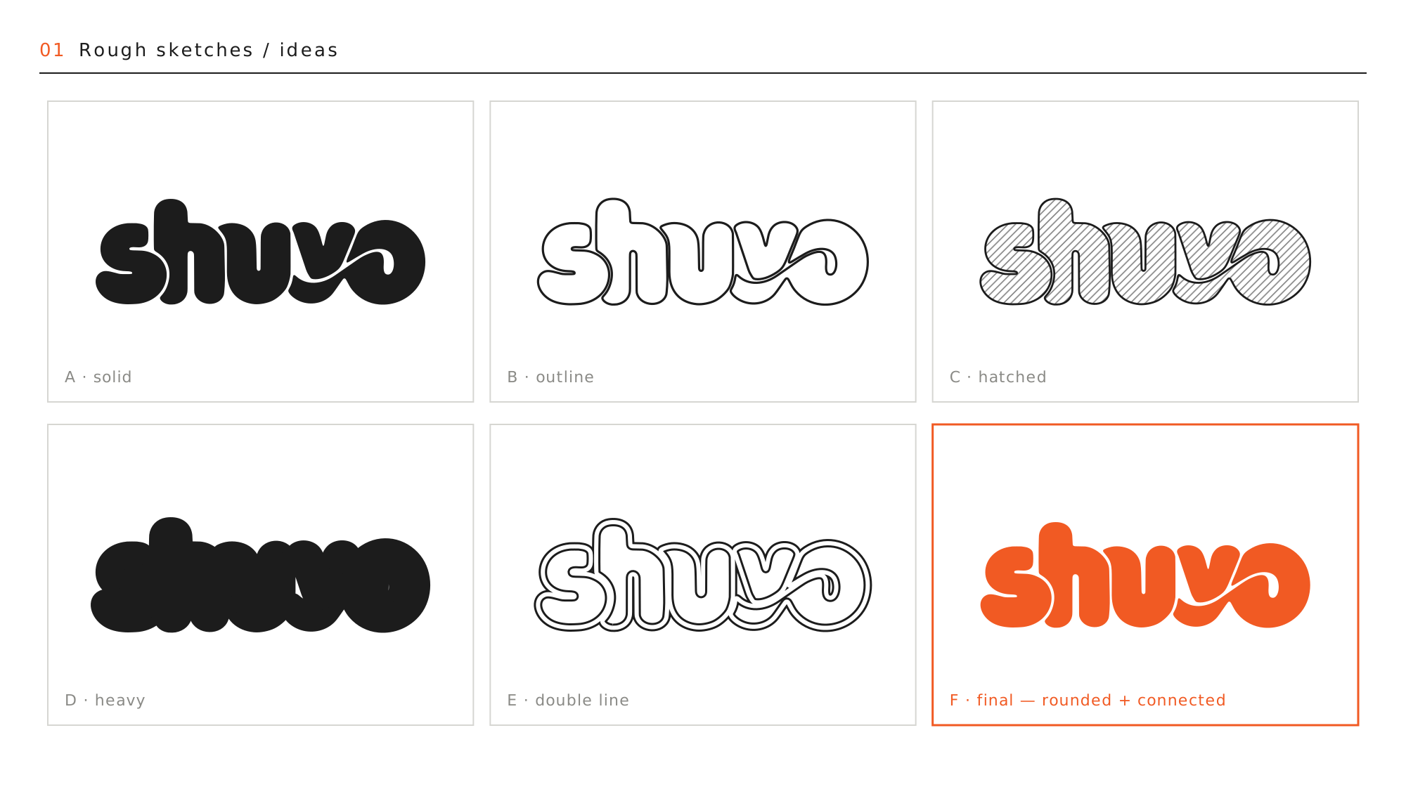
It started with rough sketches of the name in different weights and treatments (the originals are on the full sheet at the bottom). The rules I gave it:
- Explore rounded forms
- Keep it simple and minimal
- Connect the letters
- Create a smooth loop
Final direction: rounded + connected.
Anatomy
Basic construction
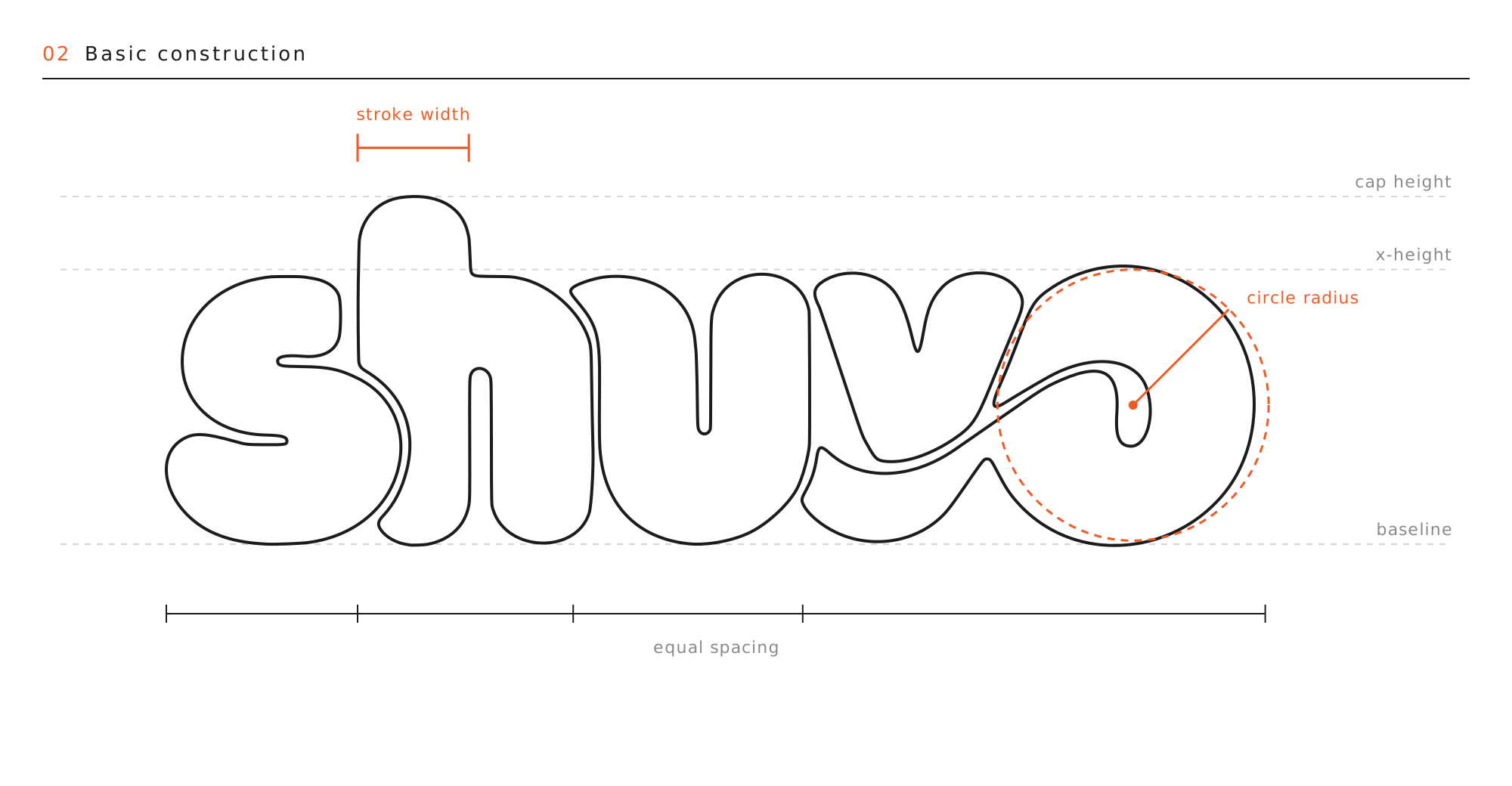
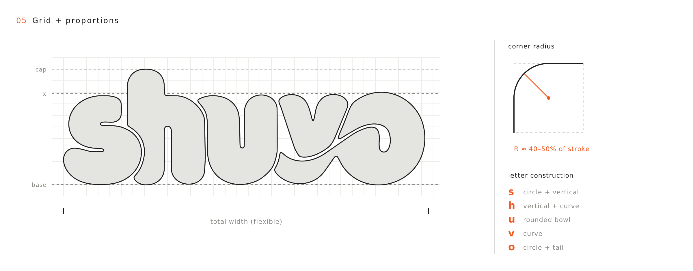
Every letter sits on cap height, x-height and baseline. One circle radius for the rounded forms, one stroke width, and equal spacing between letters.
Refine
Shape refinement
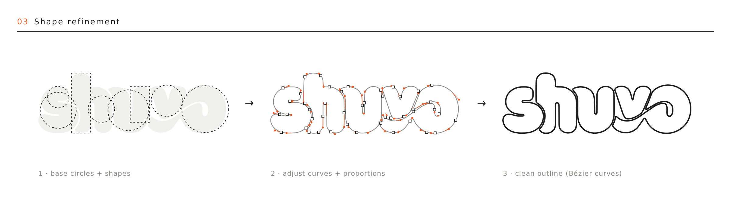
- Base circles and shapes
- Adjust curves and proportions
- Clean outline with Bézier curves
Flow
Loop flow + path
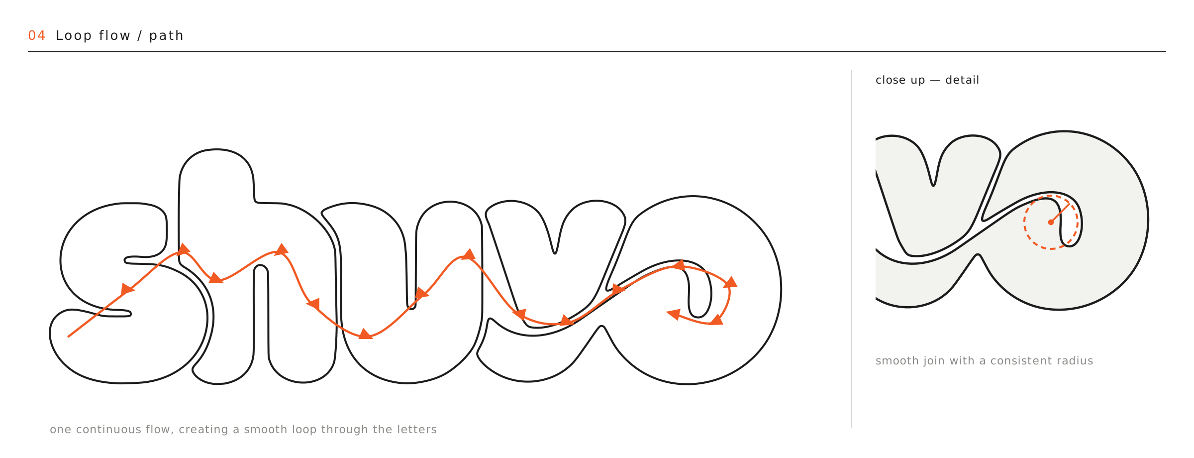
One continuous flow runs through the letters and ends in the loop between v and o. Up close the join is smooth, with a consistent radius.
Grid
Grid + proportions
The total width can flex. The corner radius stays about 40–50% of the stroke width. Each letter is a few simple parts:
- s
- circle + vertical
- h
- vertical + curve
- u
- rounded bowl
- v
- curve
- o
- circle + tail
First Final
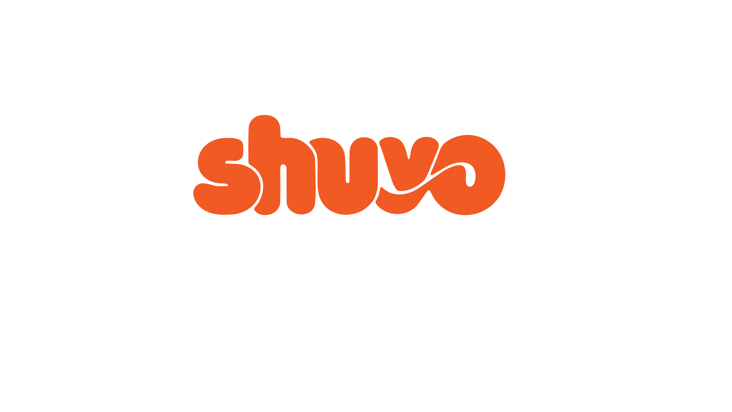
First final (Nov 1)
My first final logo, from Adobe Illustrator: a swoosh joined the v and the o. I kept it here as part of the development, then reworked it into the final below.
Coral #F15A23 · white
Final
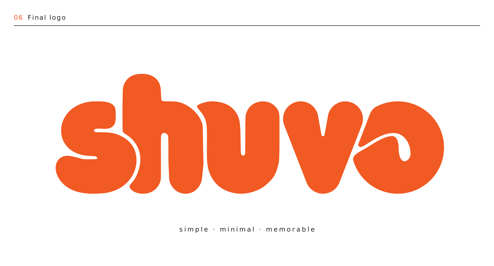
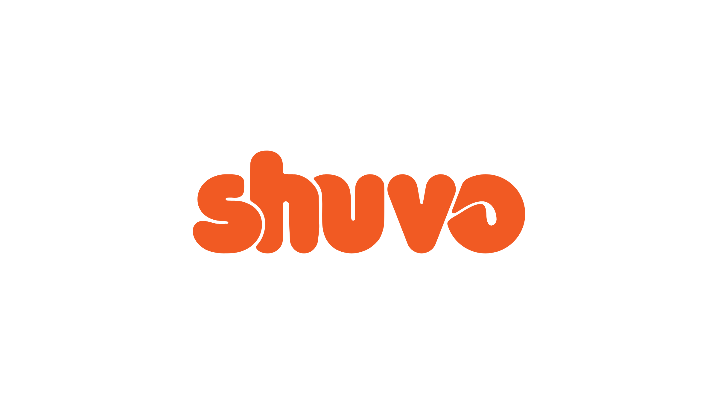
Final logo
The v became round like the u, with no sharp point, and the o got its own curl, so every letter shares one curve and sits on the same x-height and baseline. The gaps between letters are even: a little wider when the logo is small, so the letters never look stuck together.
Coral #F15A23 · white
Simple. Minimal.
Memorable.
In Motion
The final animation, as it opens my homepage: the letters swing and hit like a Newton's cradle
Never still
On my website the logo rides a soft wave, and every hover does something different. On phones it plays the moves on its own. Try them:
Nine Moves
Openings + moves
Six ways the logo can arrive, then nine ways it can react, all on one board. They play in order; pick any opening or move to watch it, or hover the board to replay. On my site, every hover over the header logo picks the next move.
The guides draw in, the outline traces itself like a pen, then the coral fills in.
Openings
Moves
Colour Ways
The Sheet