Overview A rebrand case study on Ulta Beauty.
Ulta Beauty Rebrand
- Project
- Brand Identity System
- Class
- Communication Design 4 · Identity Systems
ArtCenter College of Design - Year
- Fall 2025 – Fall 2026
- Role
- Research, strategy, logo, identity system, campaign, motion
- Tools
- Illustrator · InDesign · Procreate · mockups
Challenge
Ulta is America’s largest beauty retailer, with prestige and drugstore brands, a salon in every store, and one of the biggest loyalty programmes in retail. But its loud orange identity says deal, and it shares red-orange with Target. The brief: keep everything people already love, and make Ulta feel like a place you belong, not just a place you shop a sale.
Approach
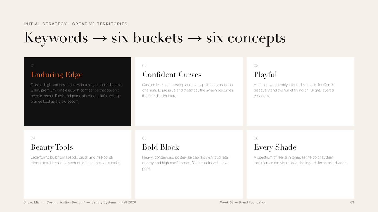
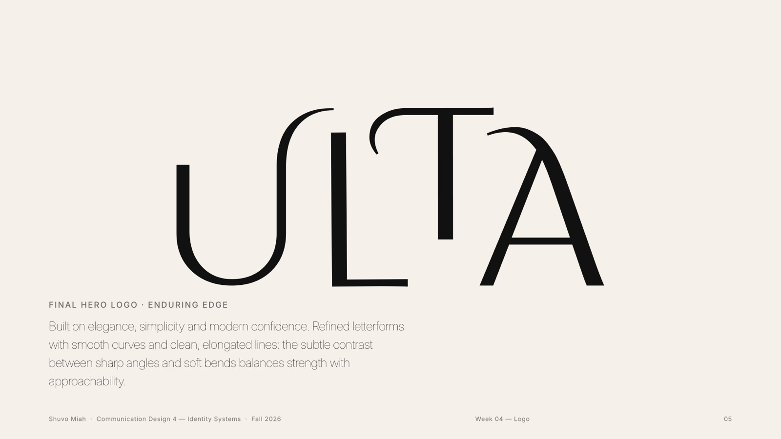
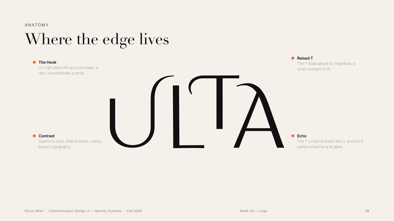
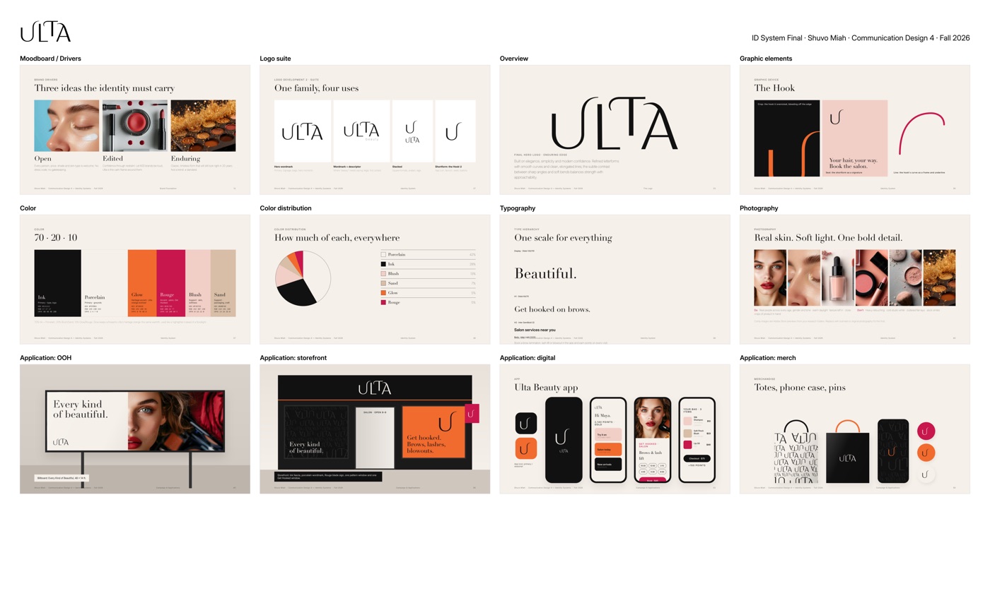
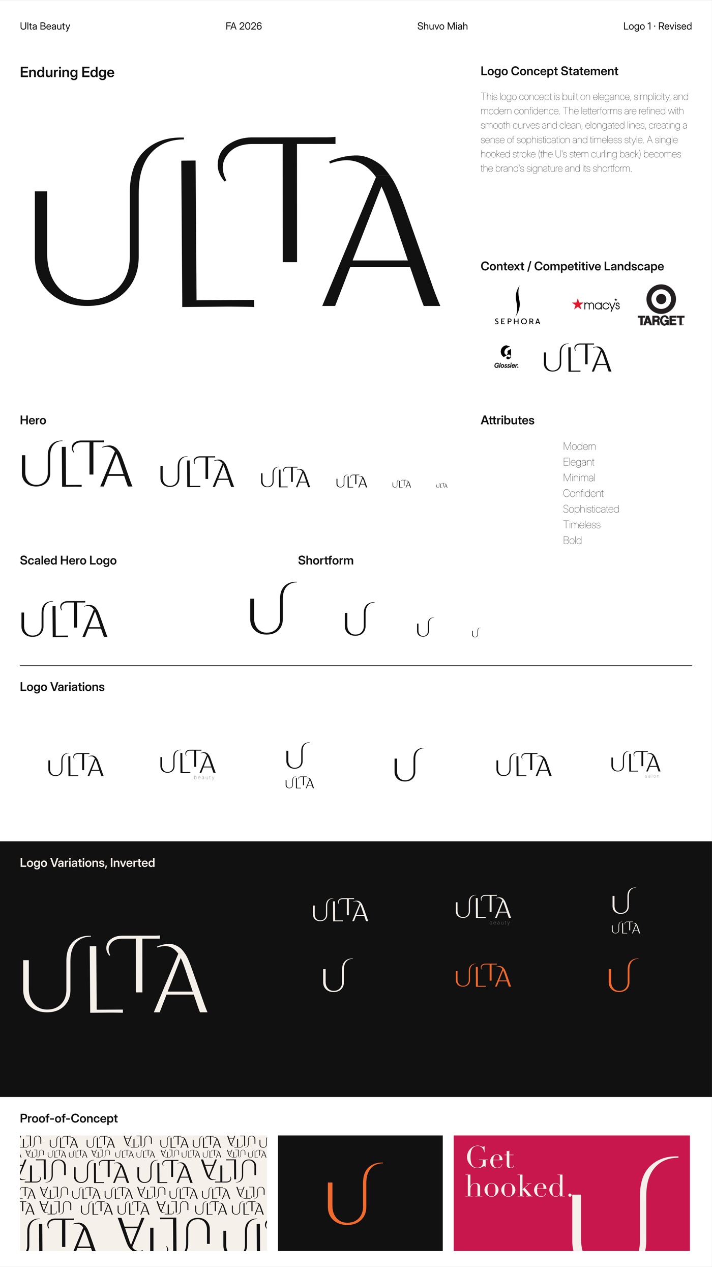
I rebuilt the brand on three ideas, Open, Edited and Enduring. The new wordmark, Enduring Edge, is drawn with fine hairlines and one long A, and its U curls back into a hook. That hook becomes the shortform, the app icon, the campaign shape and the salon’s signature. Ink and Porcelain carry the system; Ulta’s heritage orange stays on as one warm accent, “Glow”.
01Week 1 · Visual audit
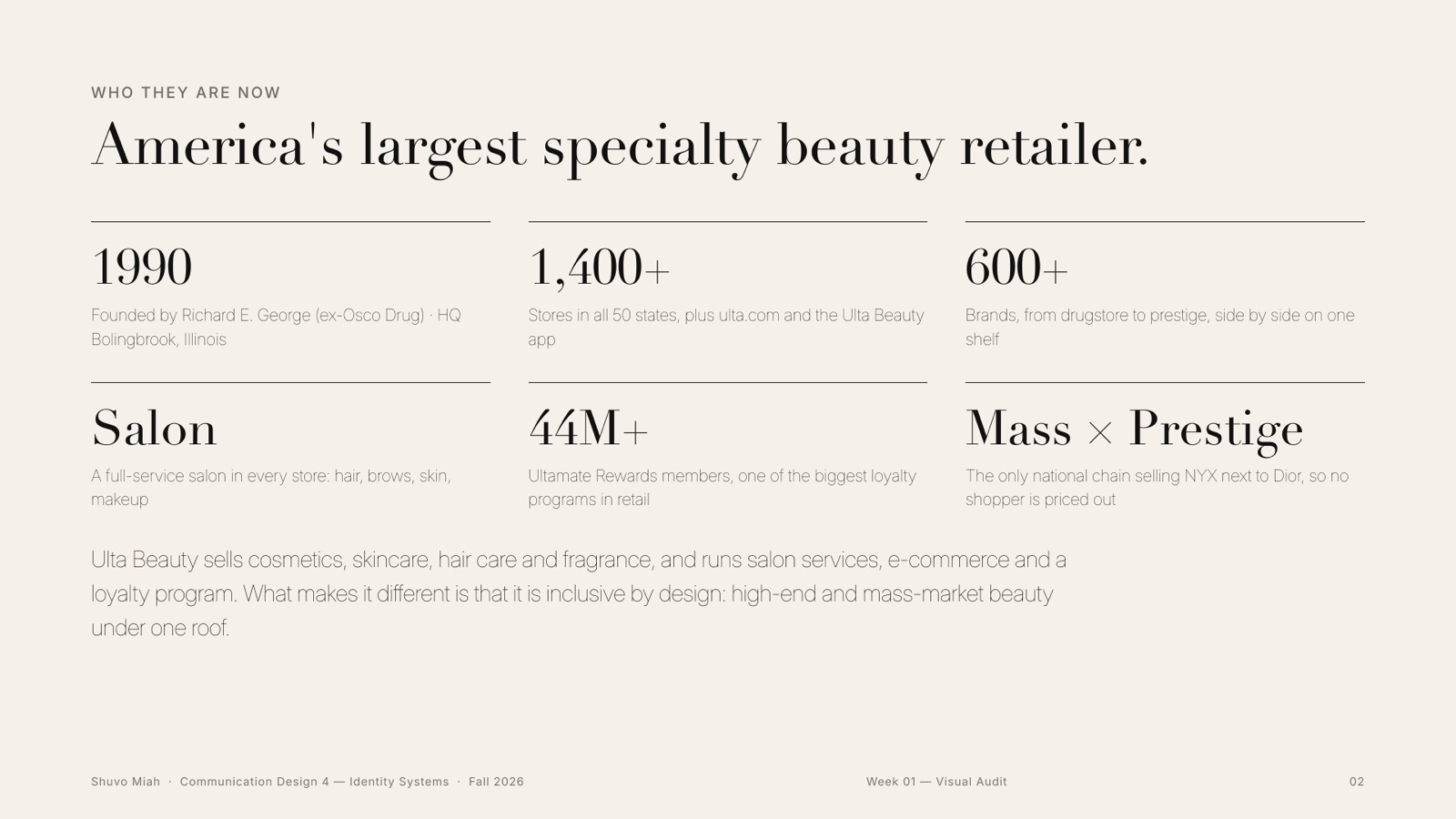
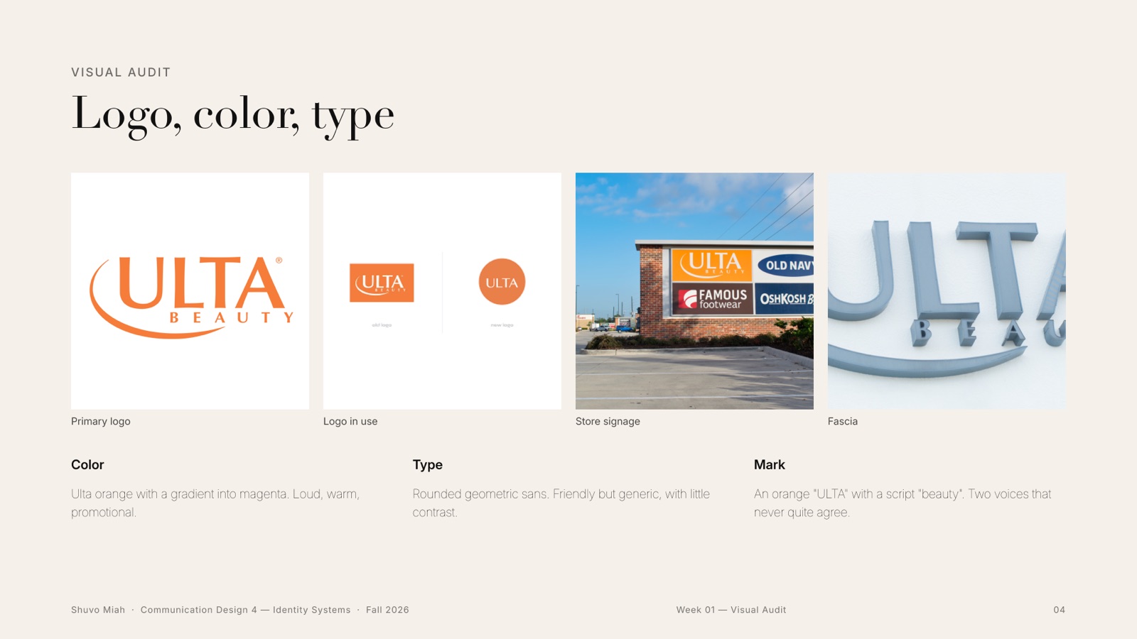
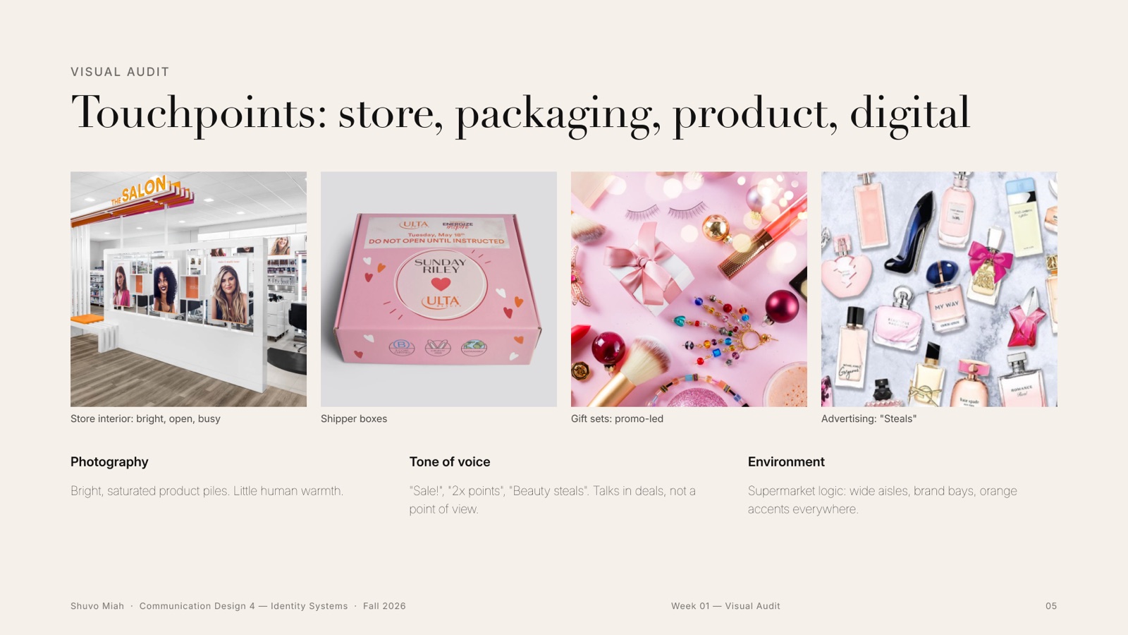
Who Ulta is today
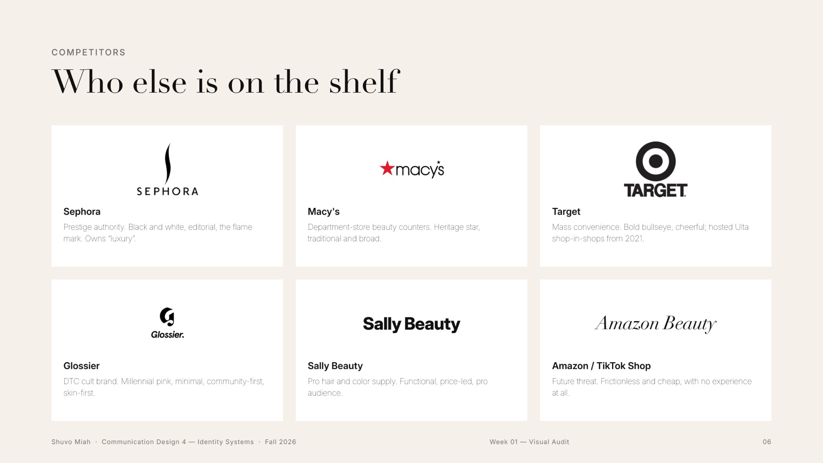
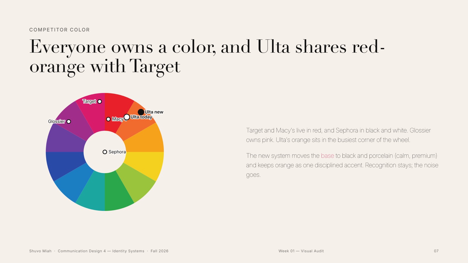
Before drawing anything I studied the brand as it is: the stores, the packaging, the app, the logo, and the six brands on the same shelf. Mapping every competitor’s colour showed the problem fast: everyone owns a colour, and Ulta shares red-orange with Target.
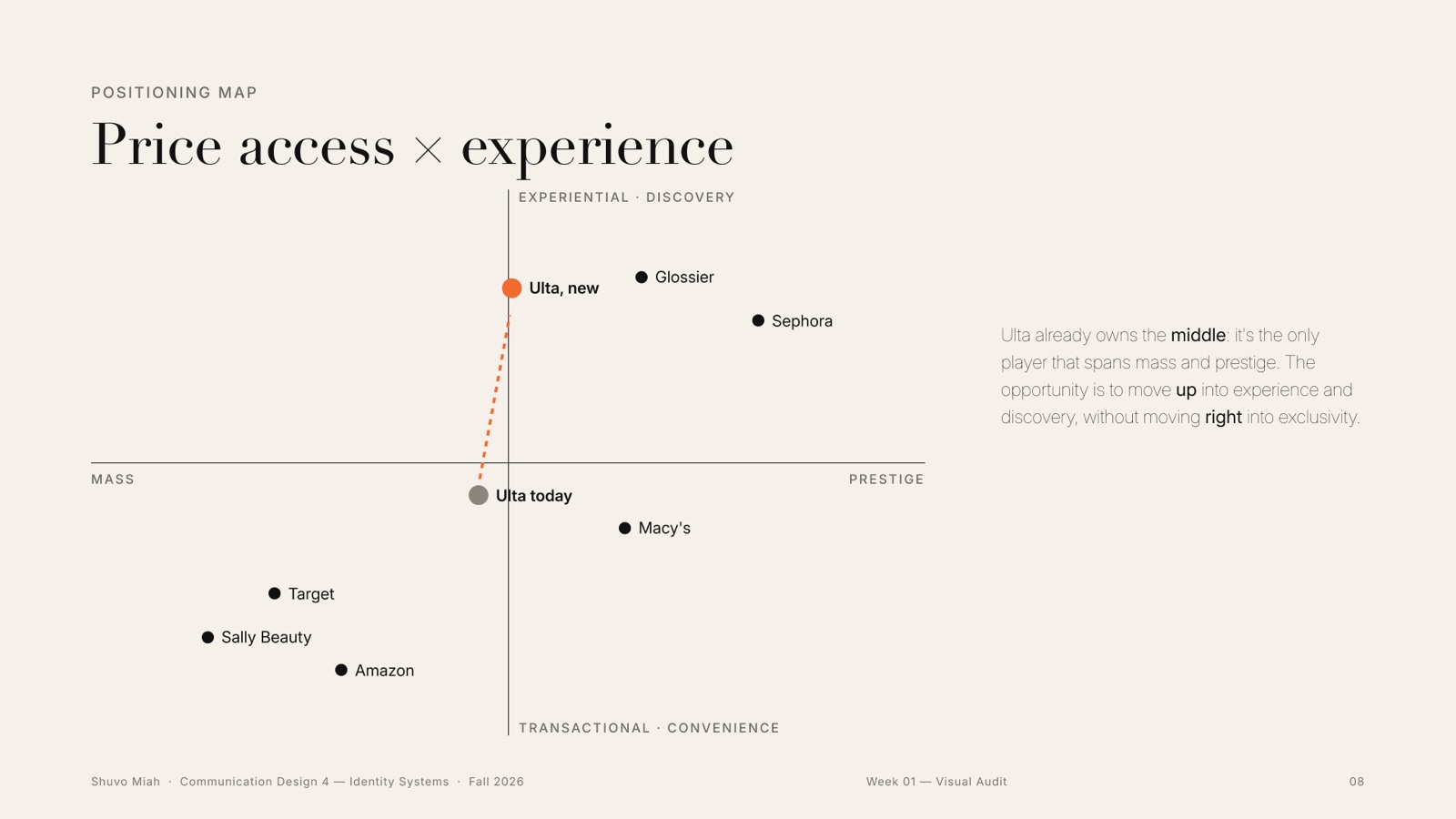
A price-access versus experience map placed Ulta between the discount stores and Sephora. The opportunity was clear: move it from discount to destination without leaving anyone behind.
02Week 2 · Brand foundation
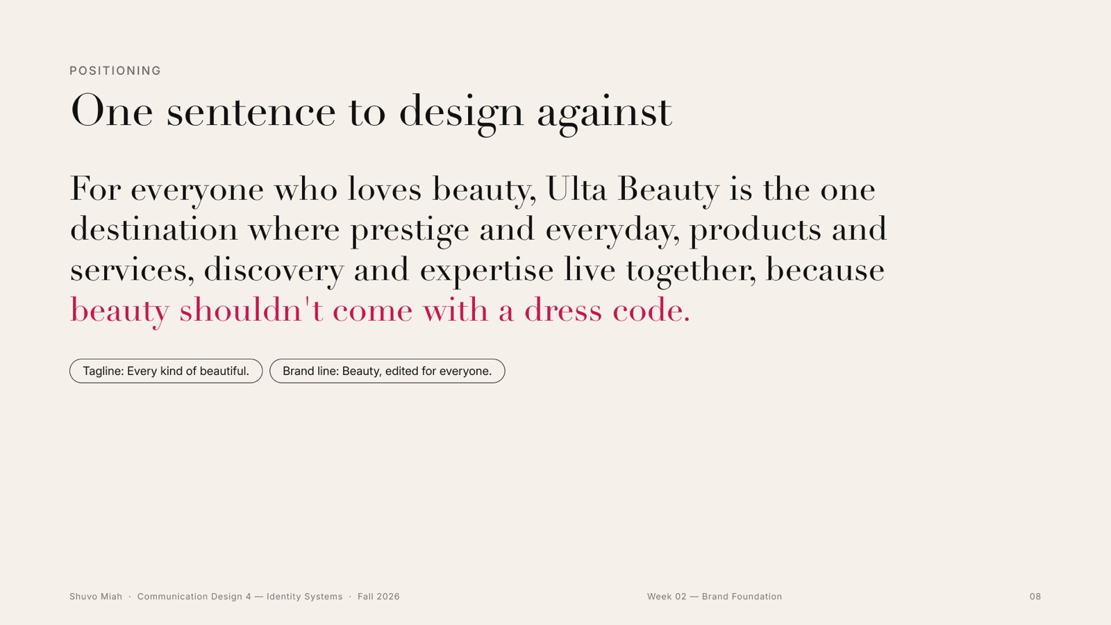
One sentence to design against
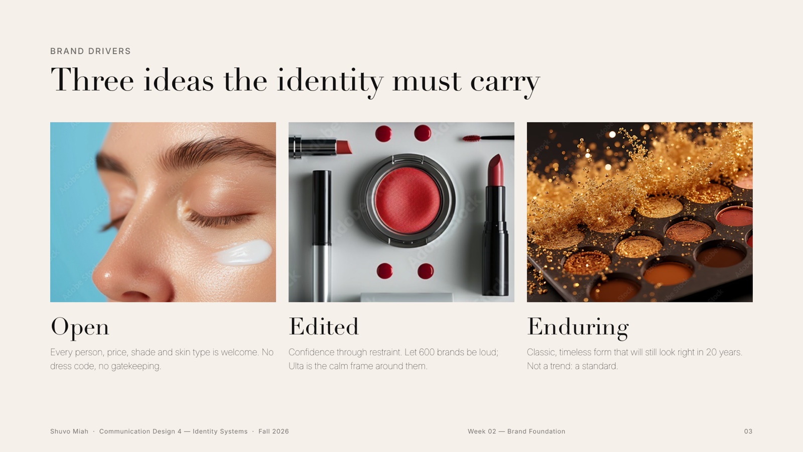
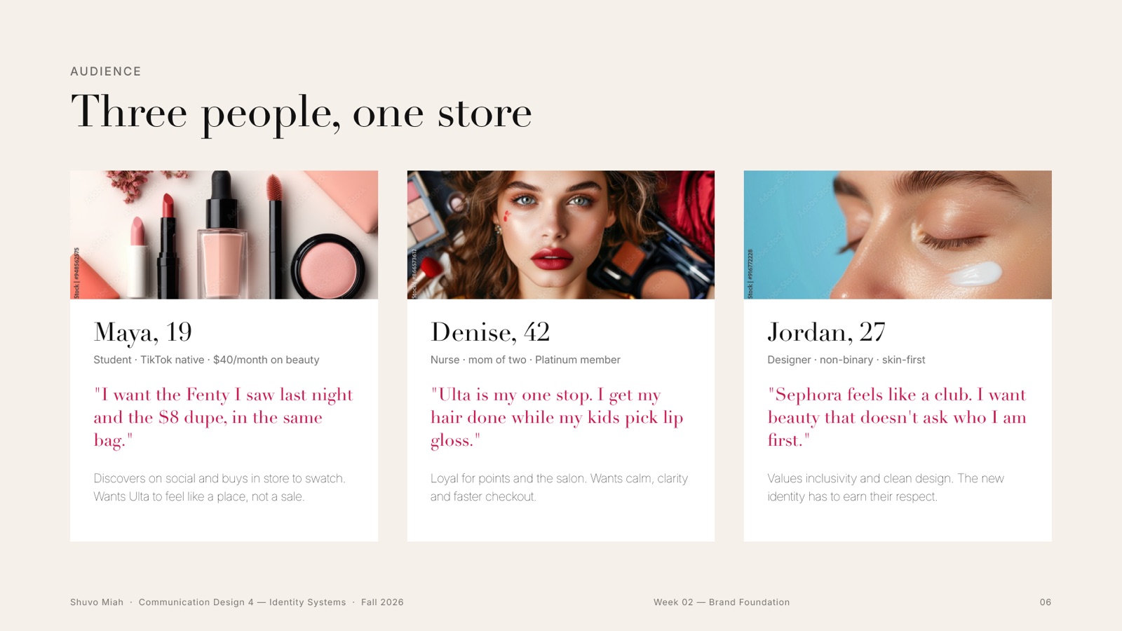
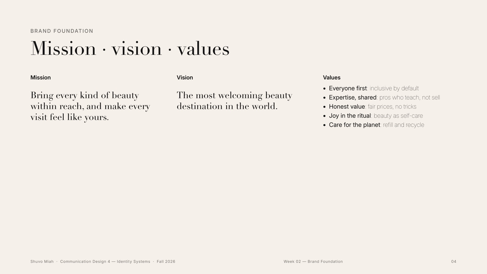
I wrote the goal, three brand drivers, the mission and values, a personality, and three people who would walk into the same store: Maya, 19, Denise, 42, and Jordan, 27. Then the positioning, in one line I could test every drawing against.
Turn Ulta from the place you go for a deal into the place you go to belong, without losing a single customer it has today.
03Week 3 · Shape + typeface
Hand first, then fifty wordmarks
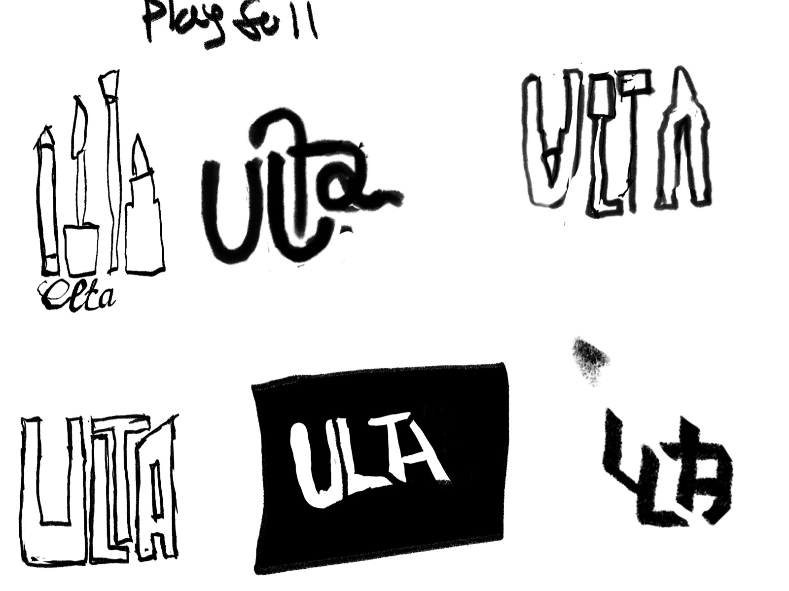
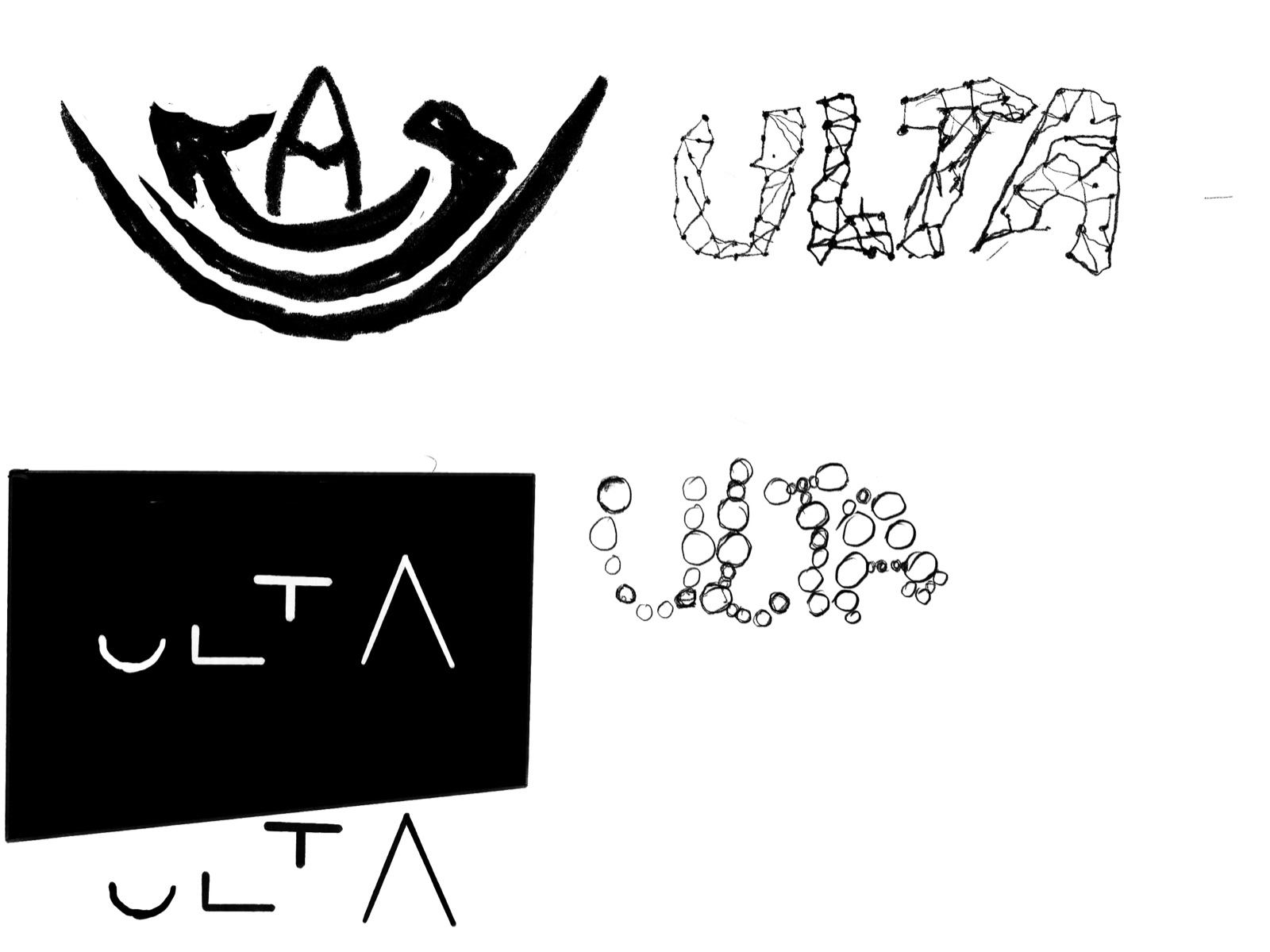
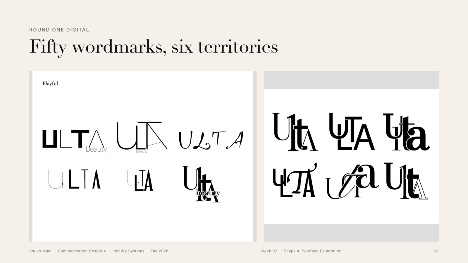
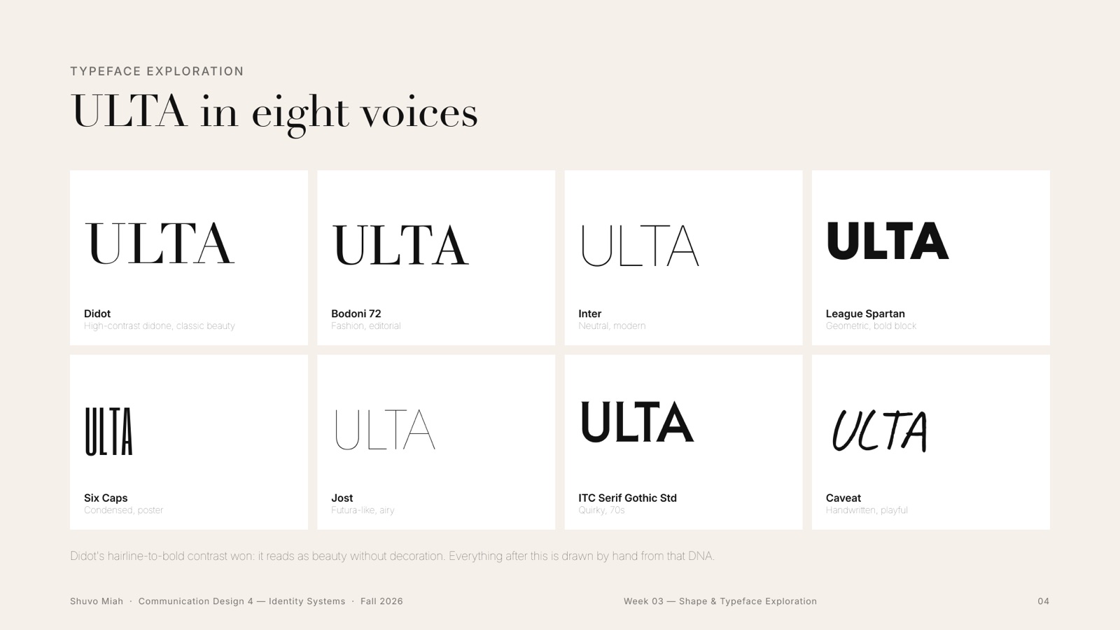
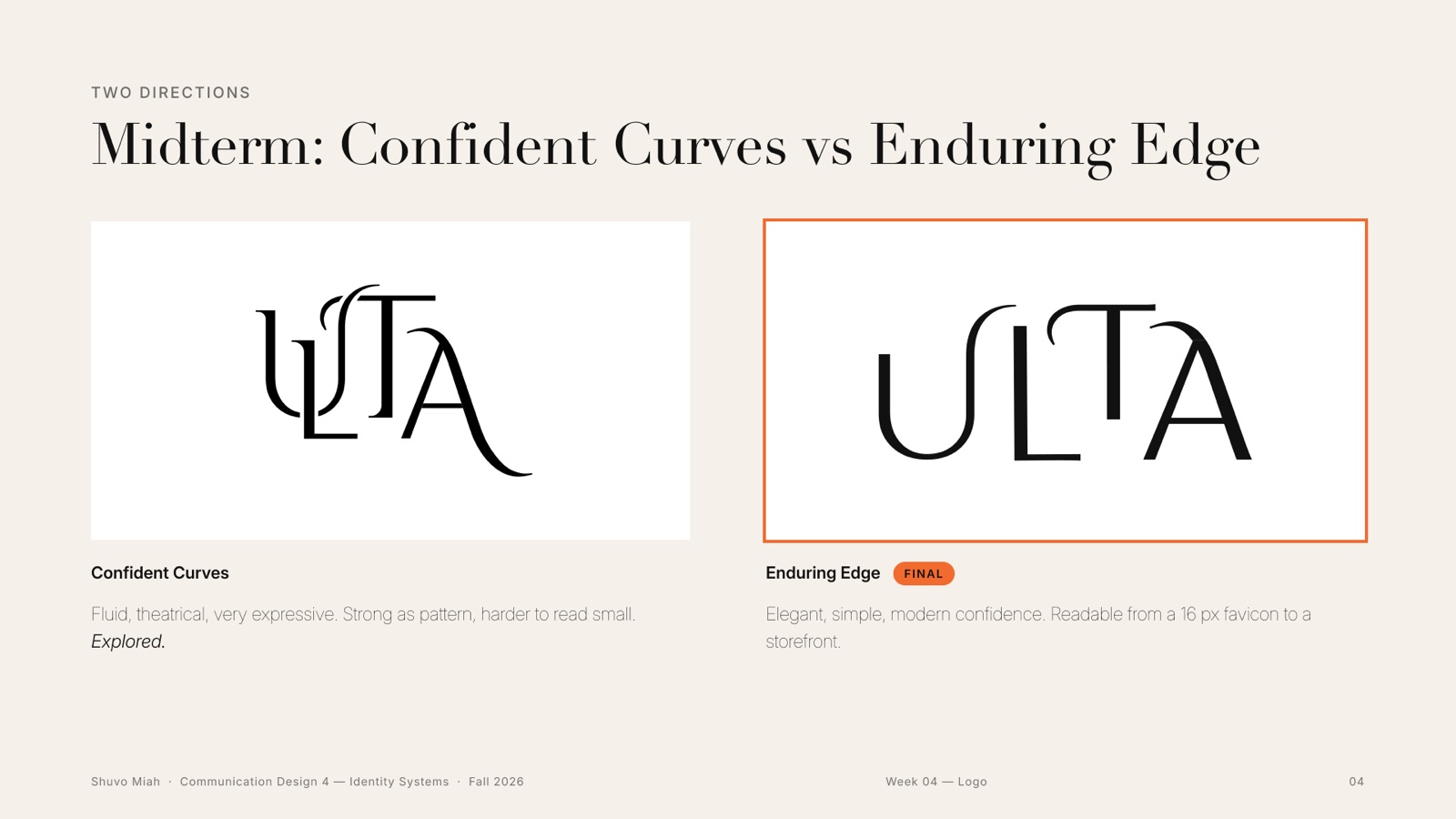
Every territory started on paper. I sketched playful, bold and elegant versions by hand in Procreate, then drew fifty digital wordmarks across six territories and set ULTA in eight typefaces, to hear each voice.
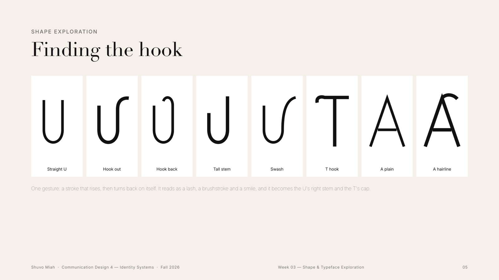
One shape kept coming back: a U whose right stem curls over. I called it the hook.
04Weeks 3–7 · Logo rounds
Four months under the red pen
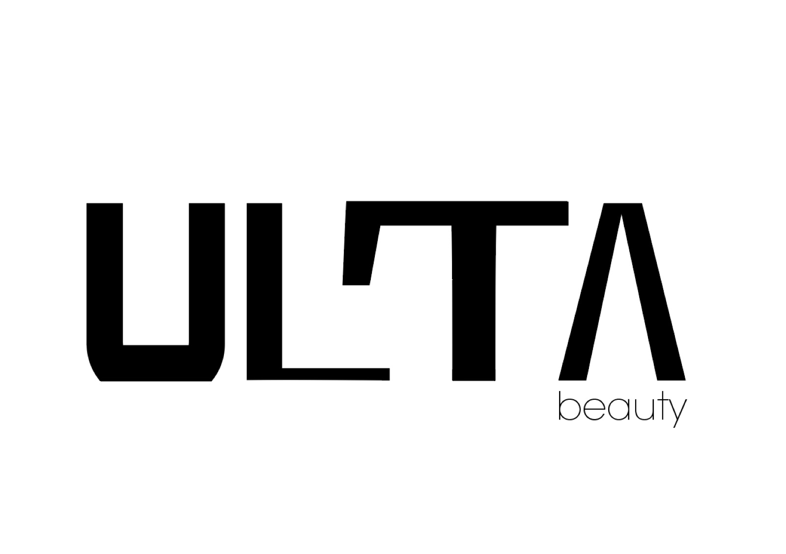
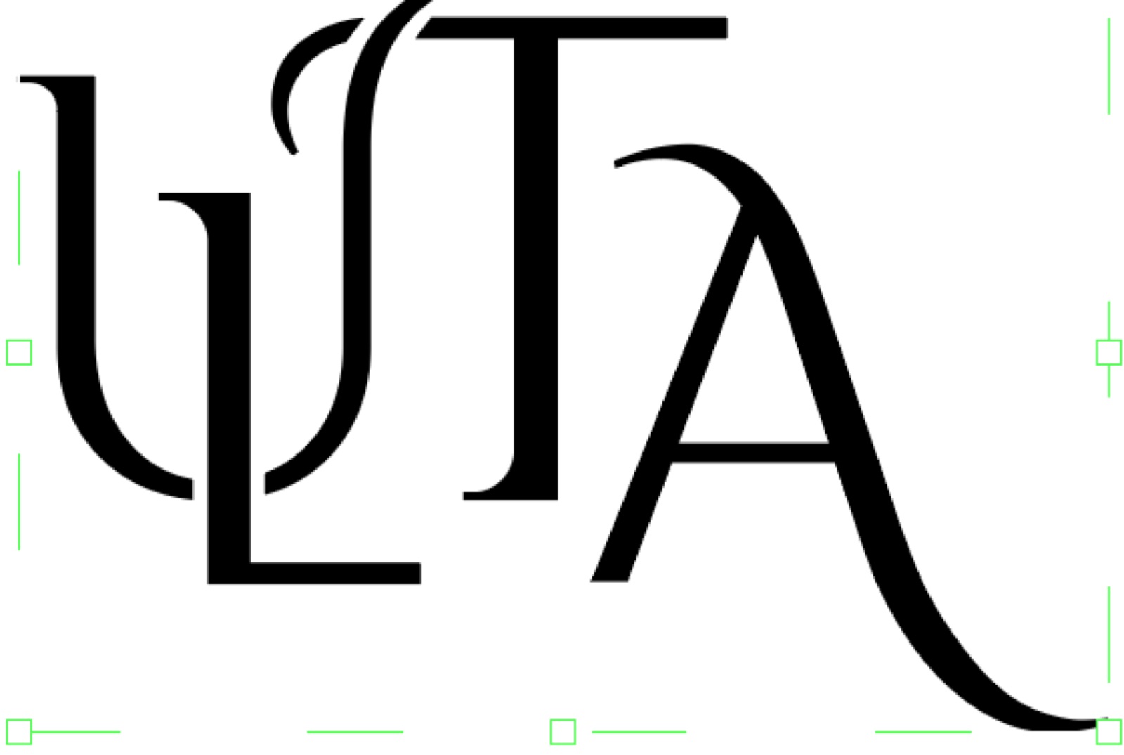
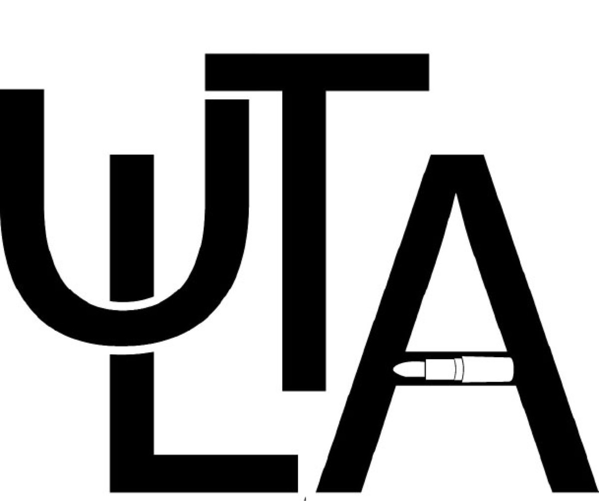
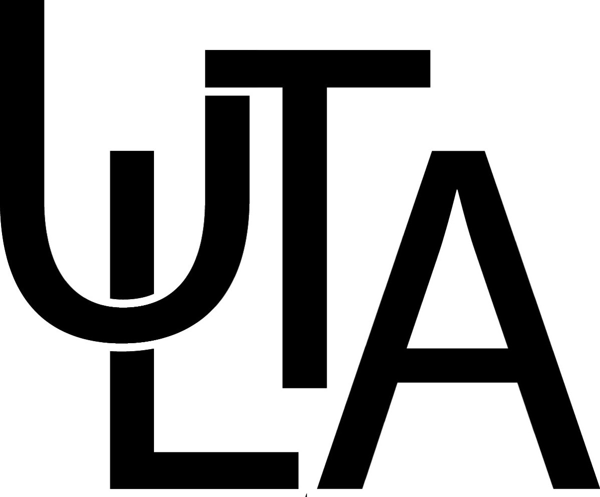
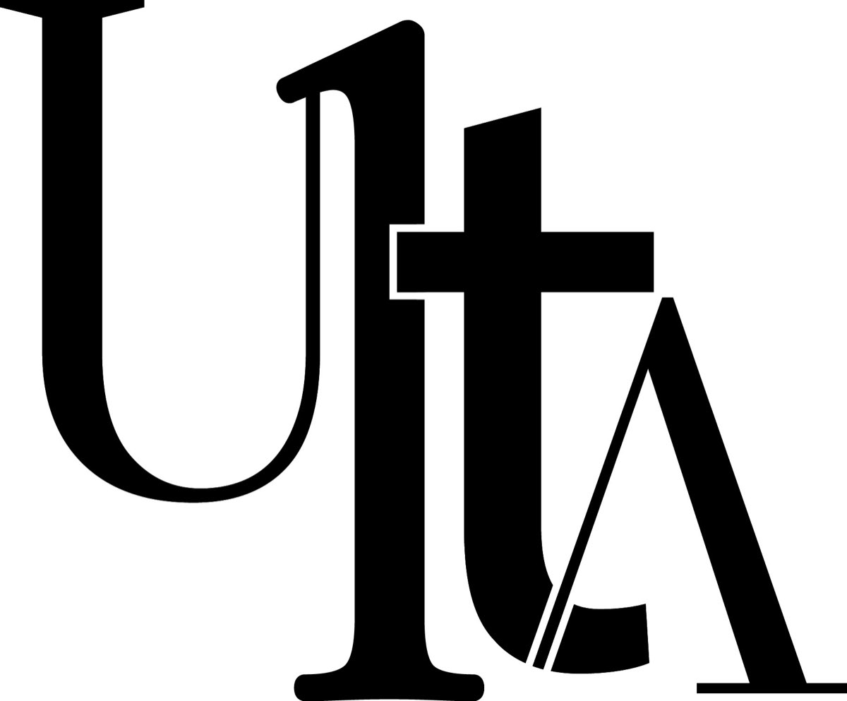
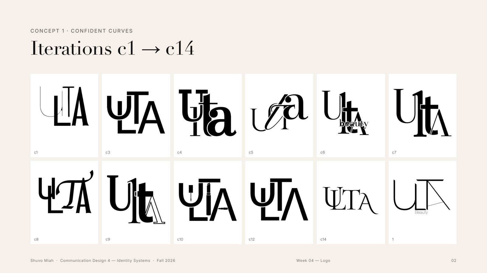
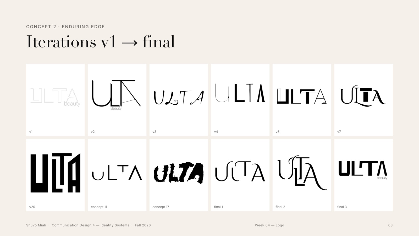
These are the real screens from my Illustrator files, in date order. Drag the slider to watch the logo change: heavy blocks, lipstick-shaped letters, the first hook, the critique marks, and finally the hairline Enduring Edge.
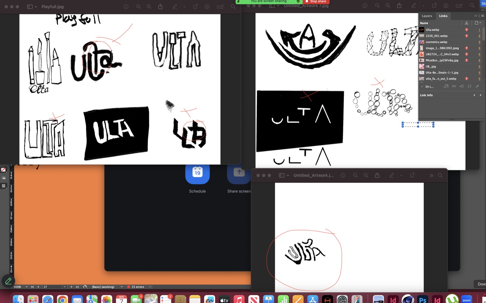
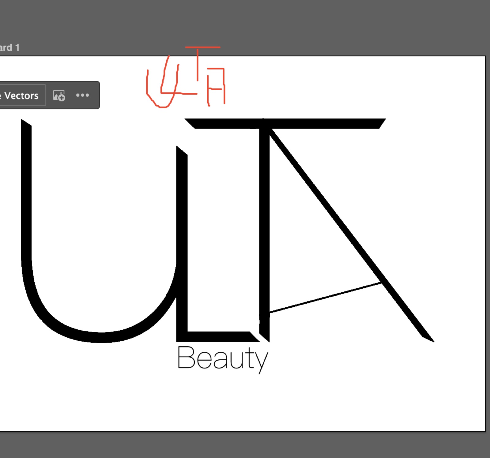
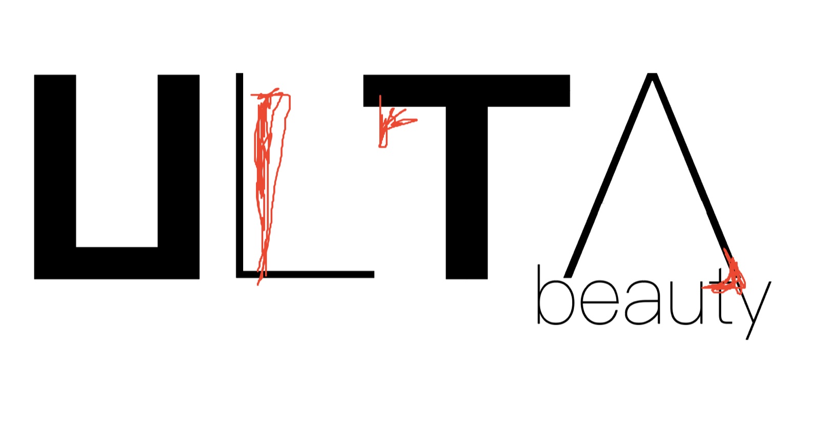
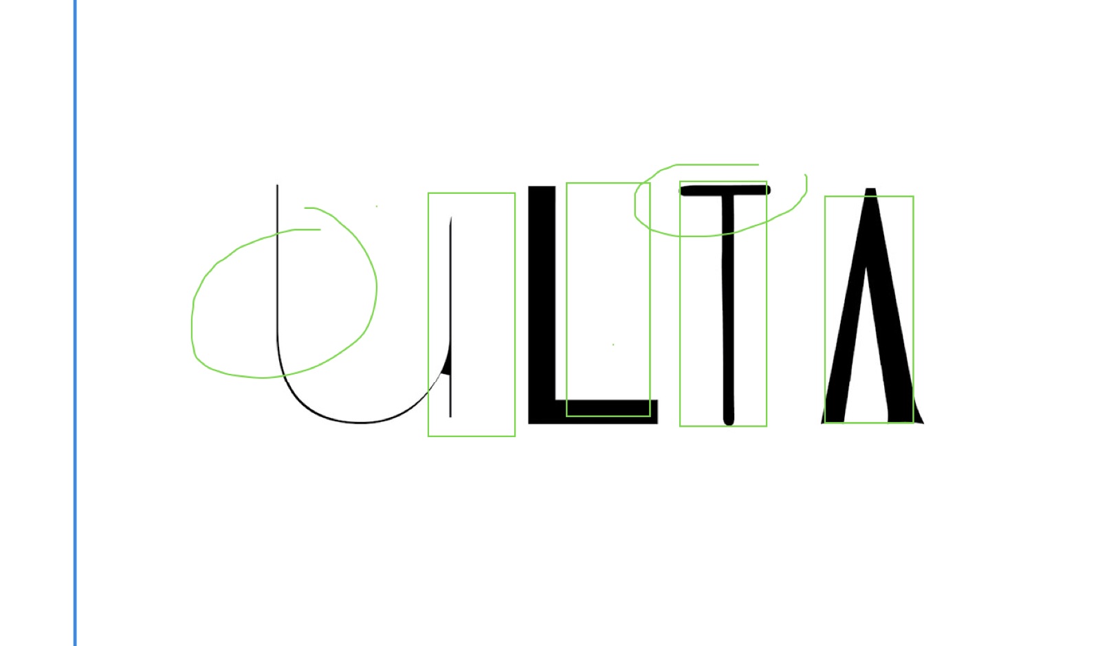
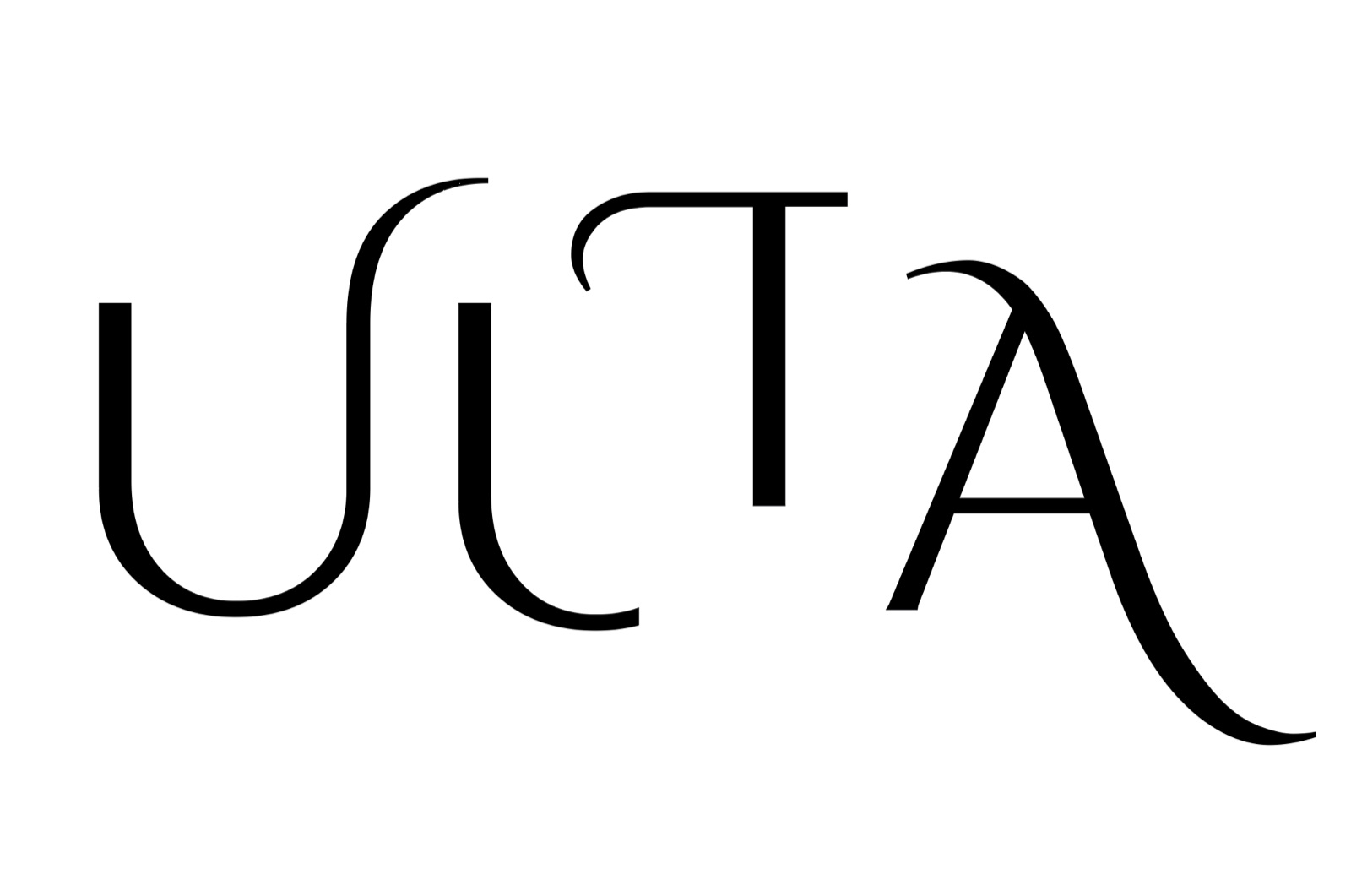
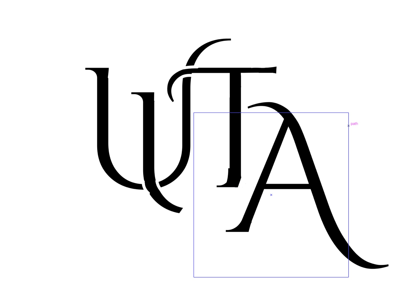
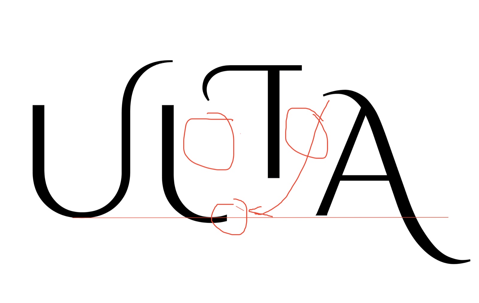
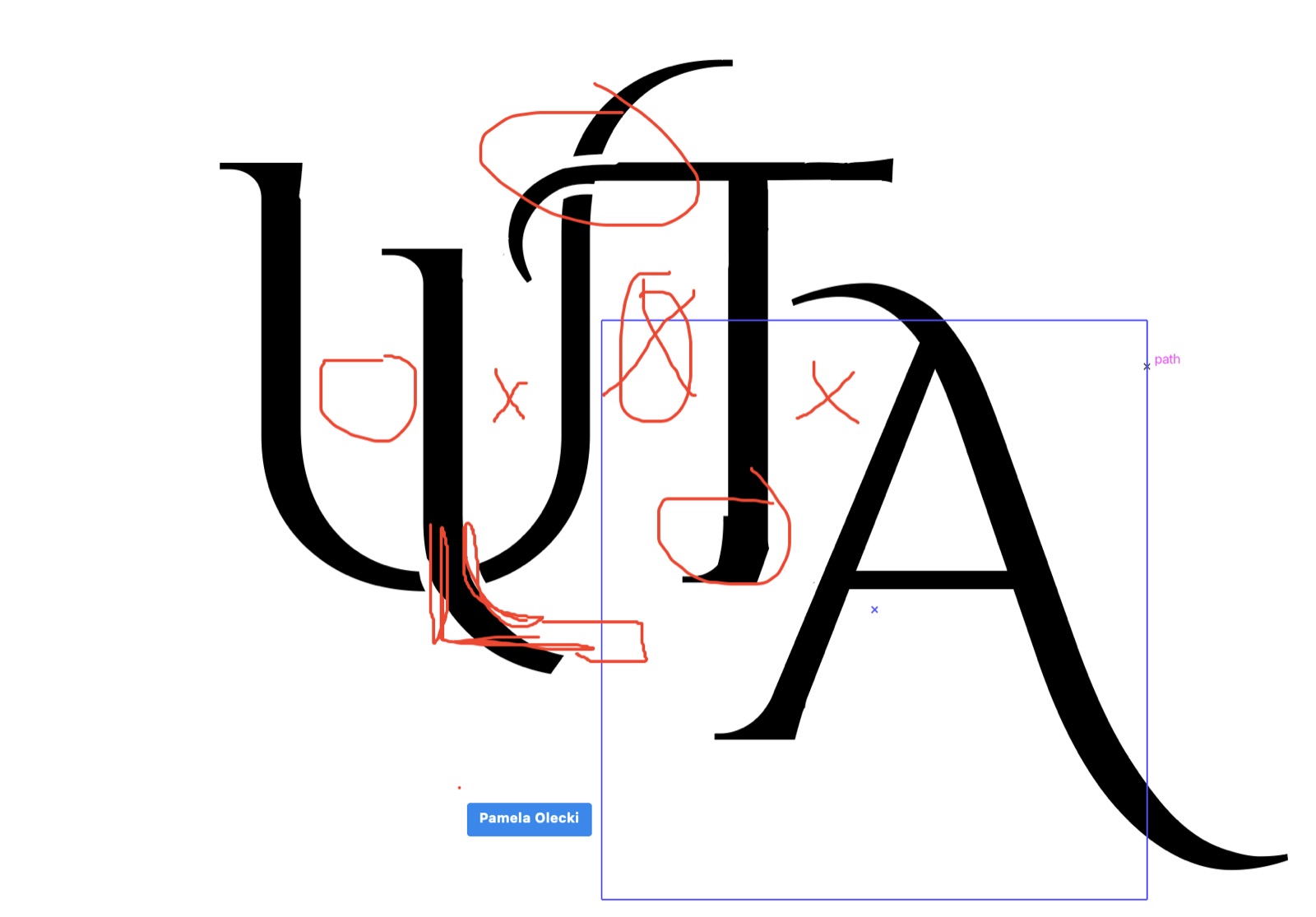
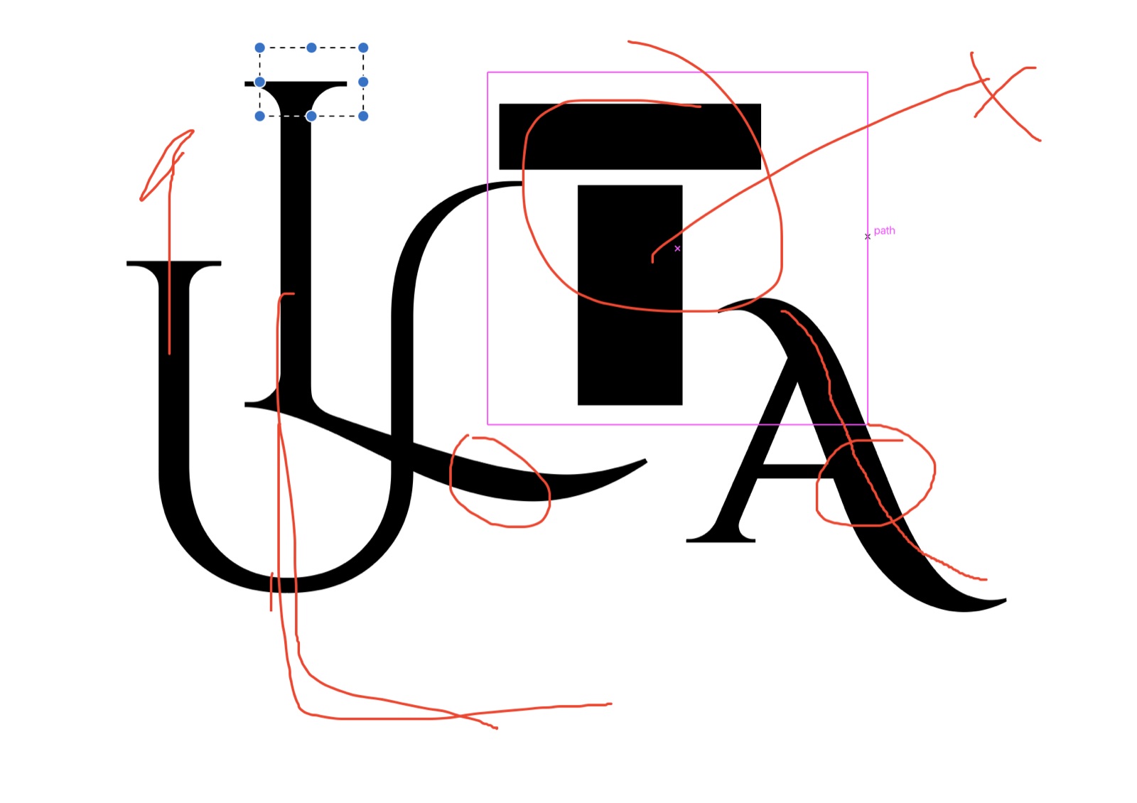
Nov 7 2025 Sketch critique: the strongest ideas circled in red
05Weeks 5–6 · LogoDev 2 + 3
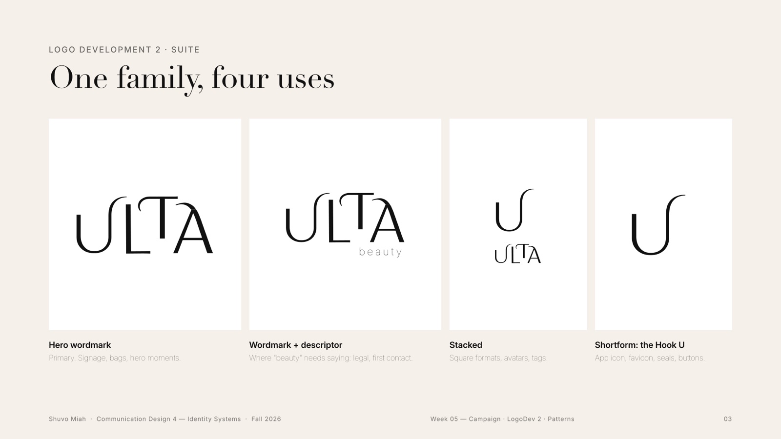
One family, four uses
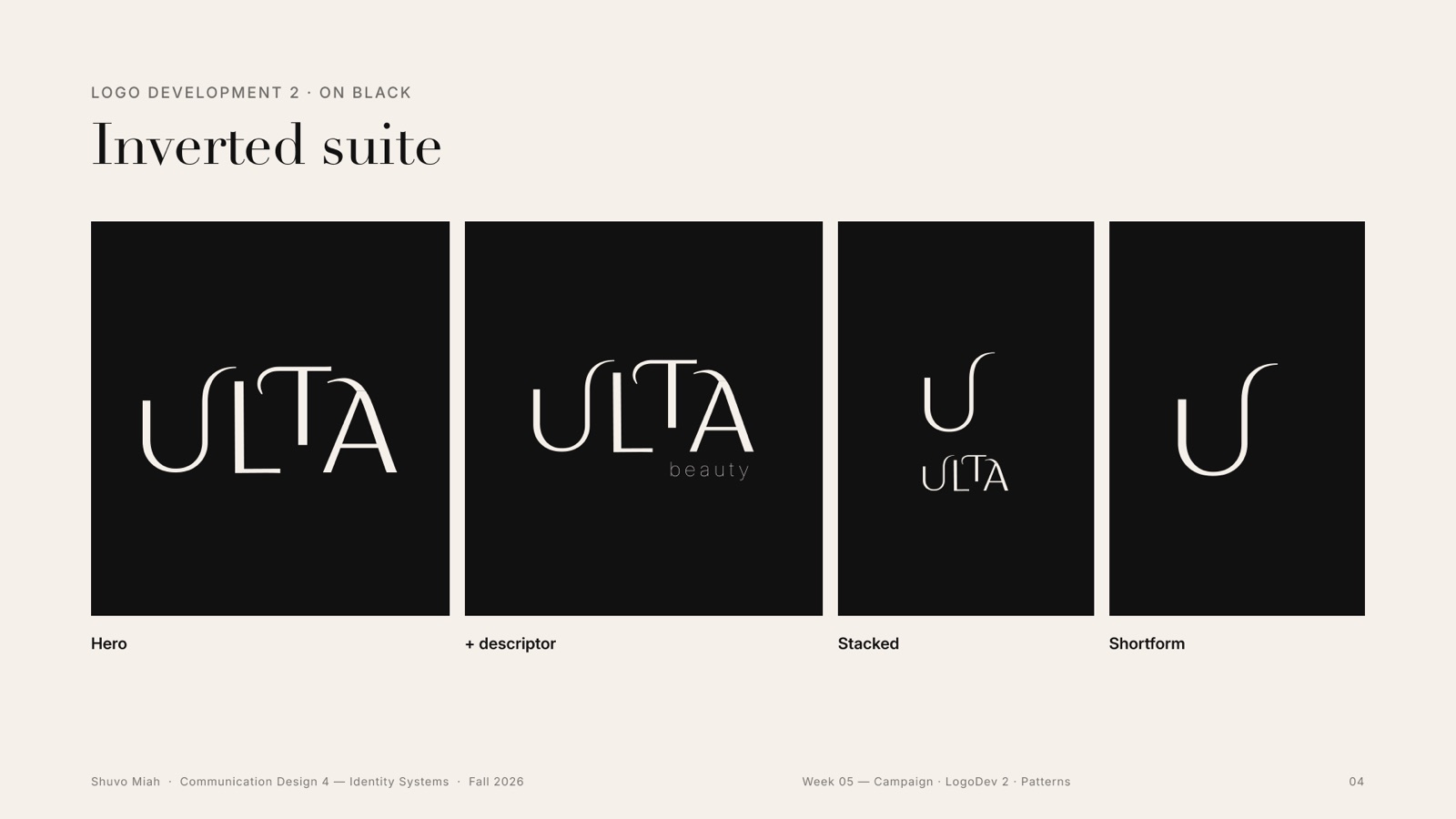
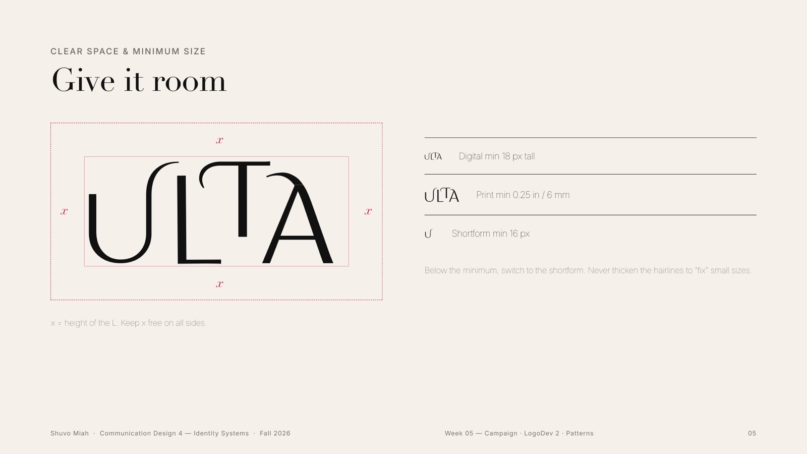
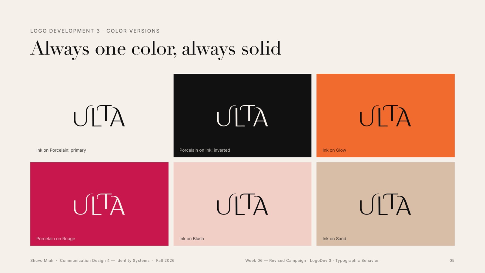
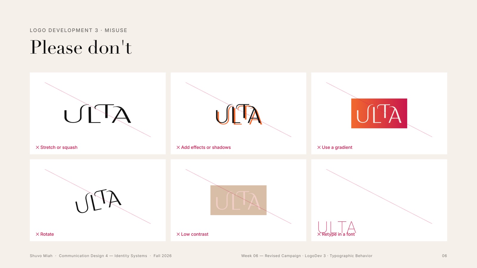
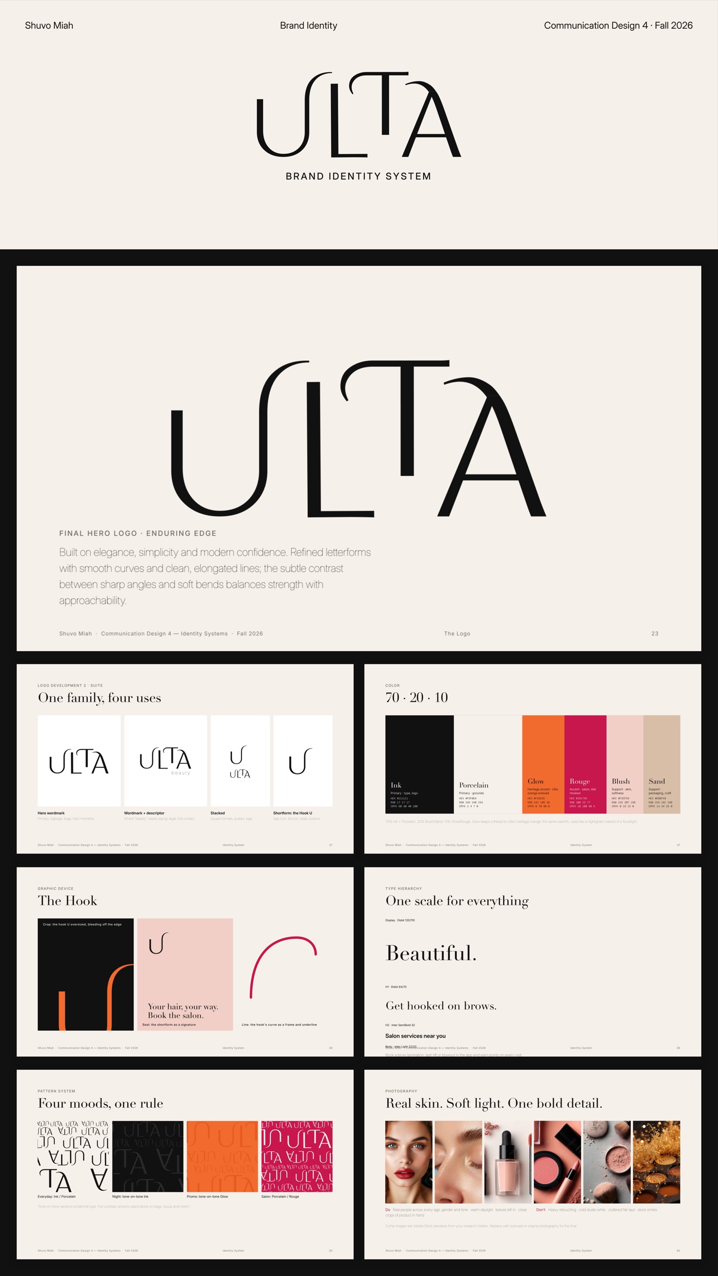
The hero wordmark became a family: hero, hero with “beauty”, stacked, and the shortform hook. Each got an inverted version, clear space and a minimum size, one solid colour at a time, and a short list of things never to do.
06Week 5 · Patterns
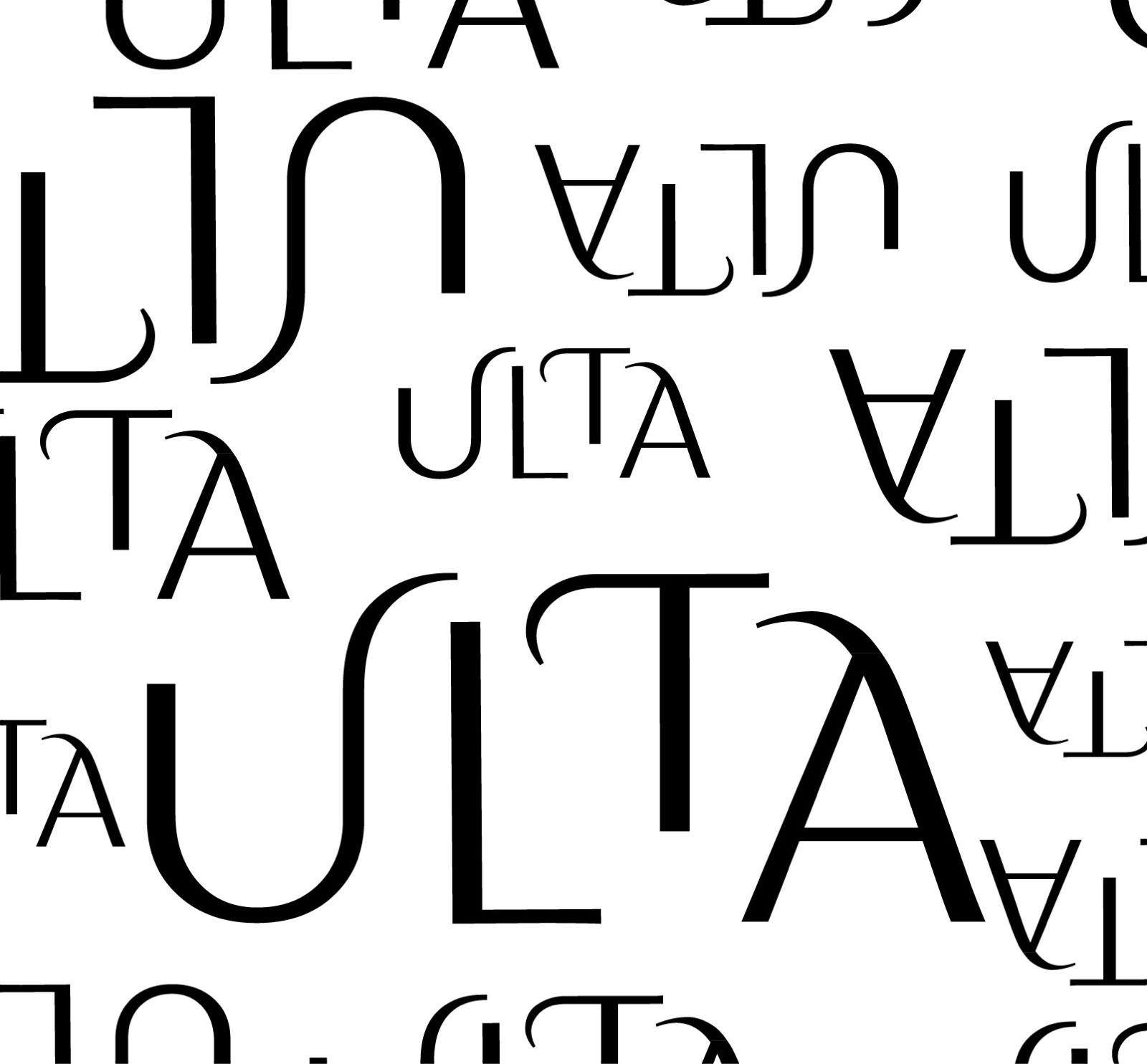
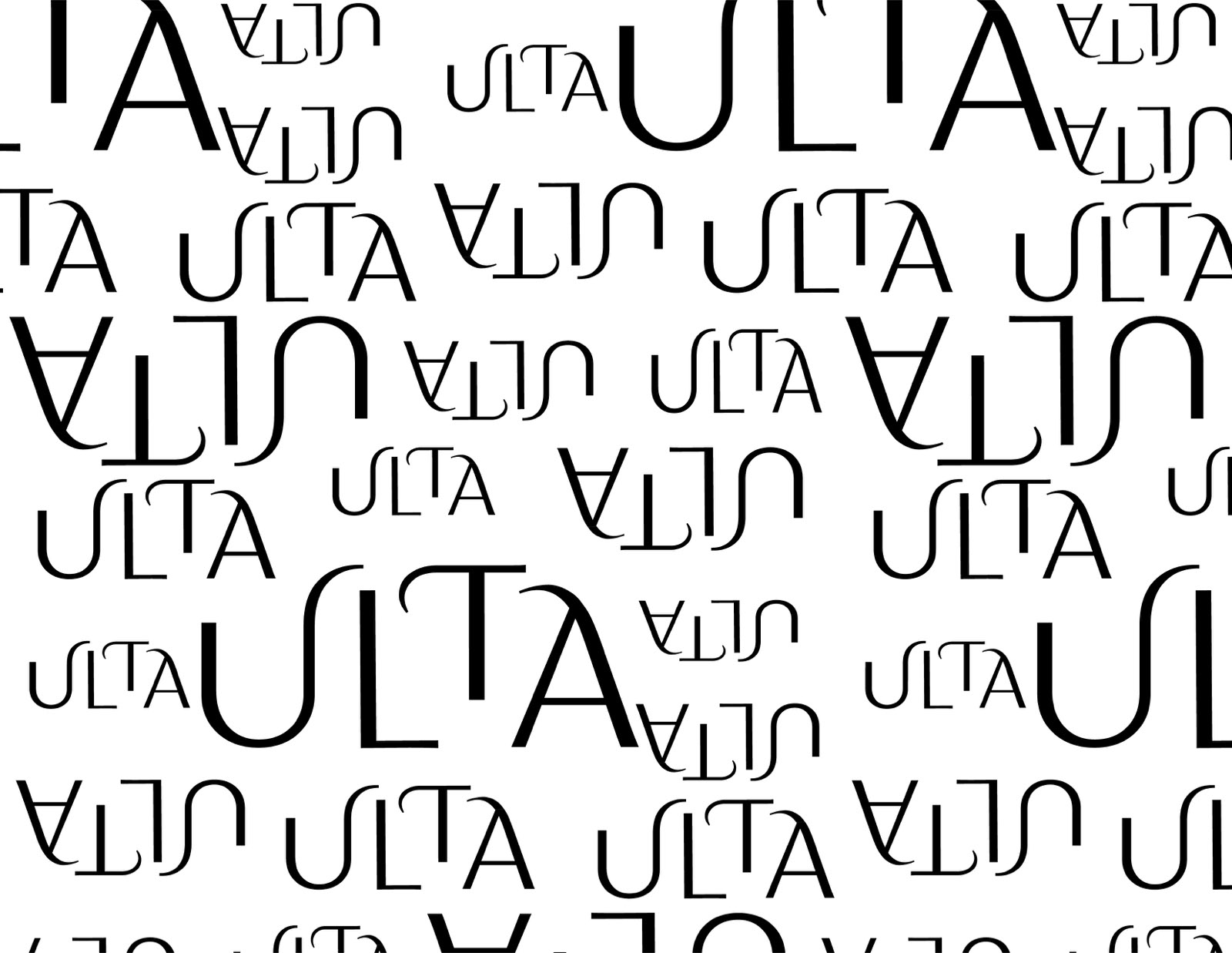
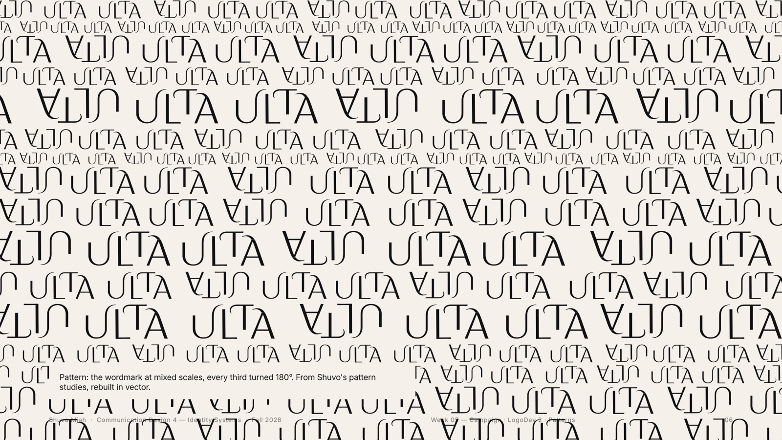
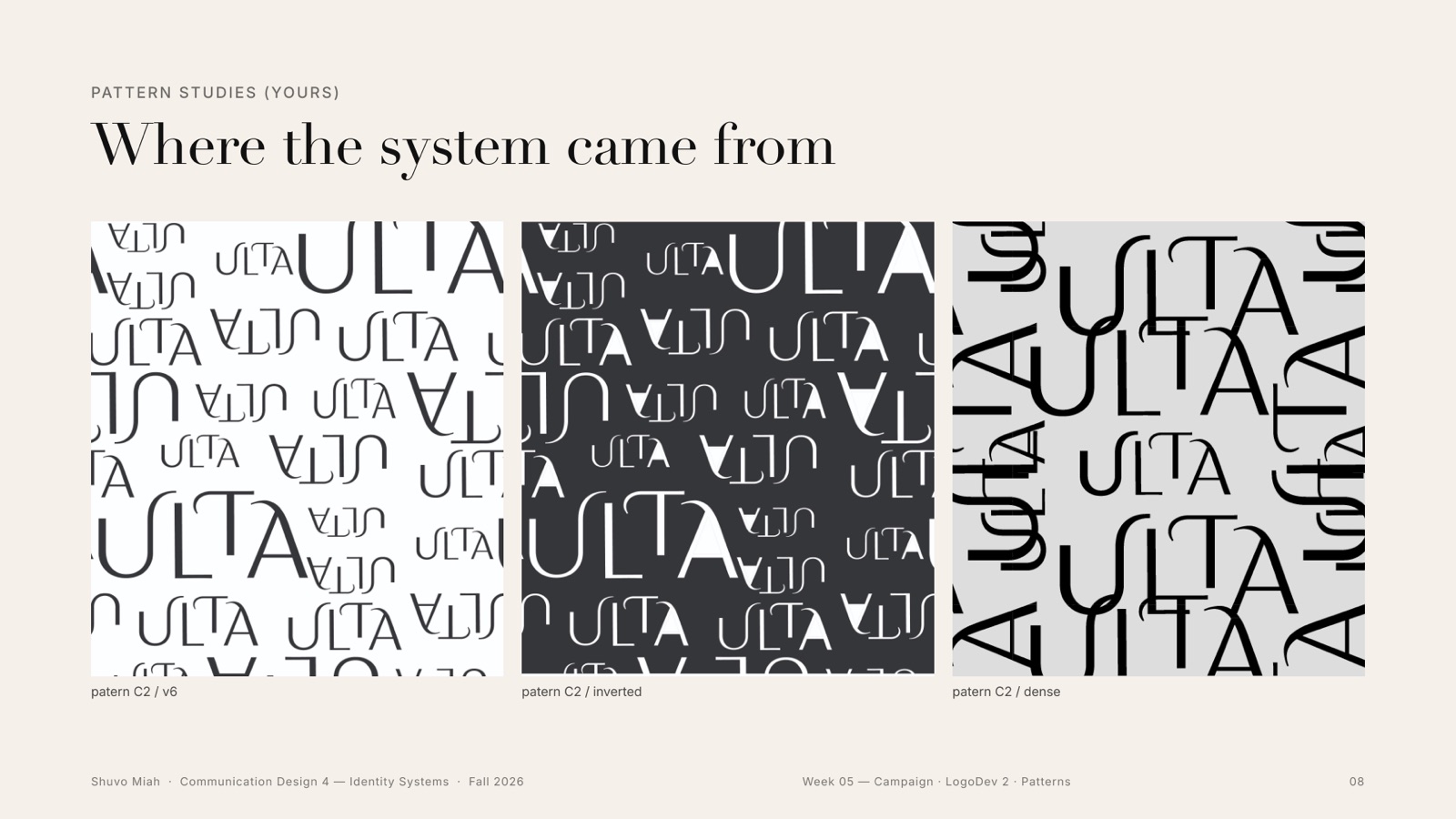
The wordmark at mixed scales
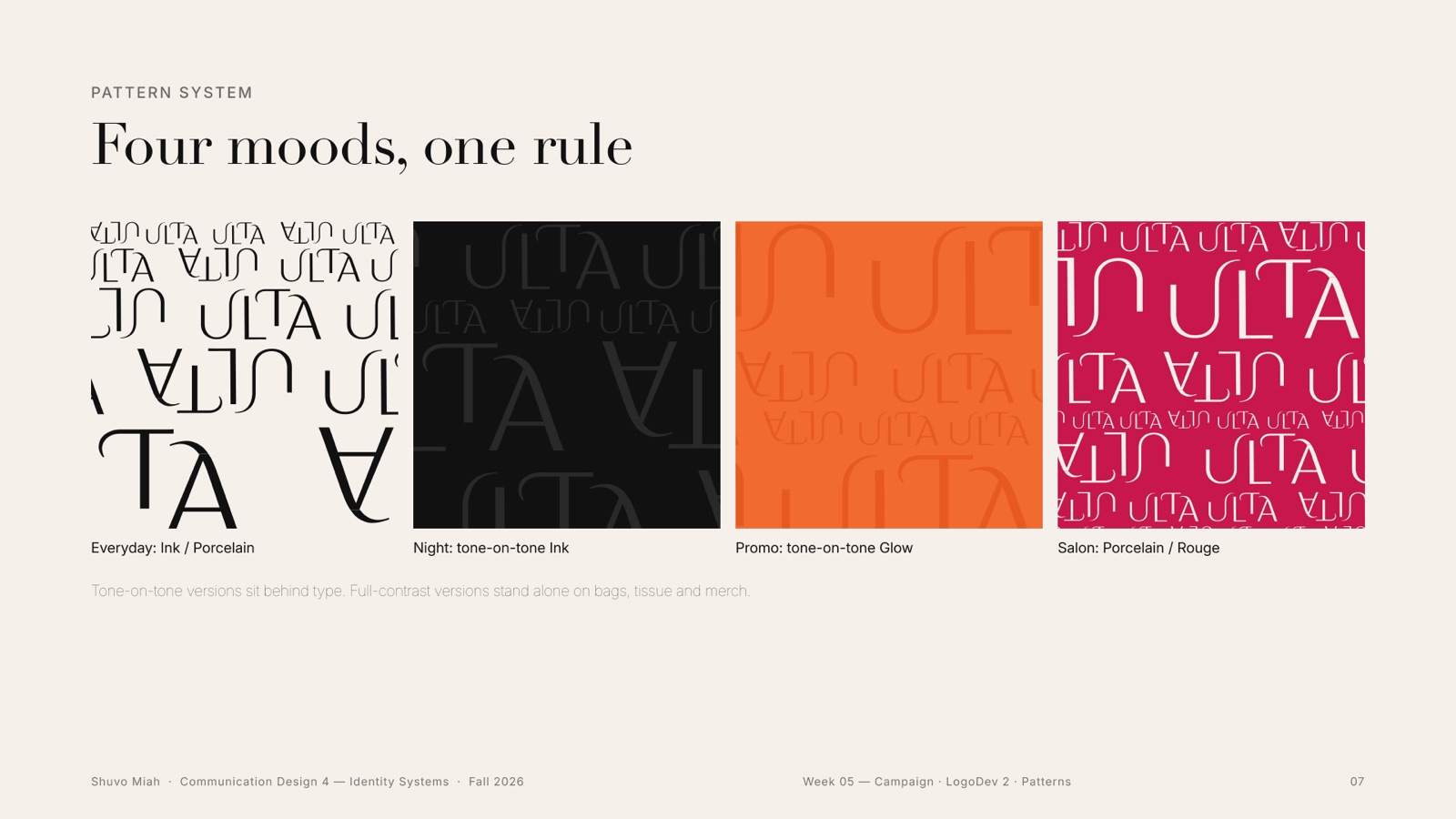
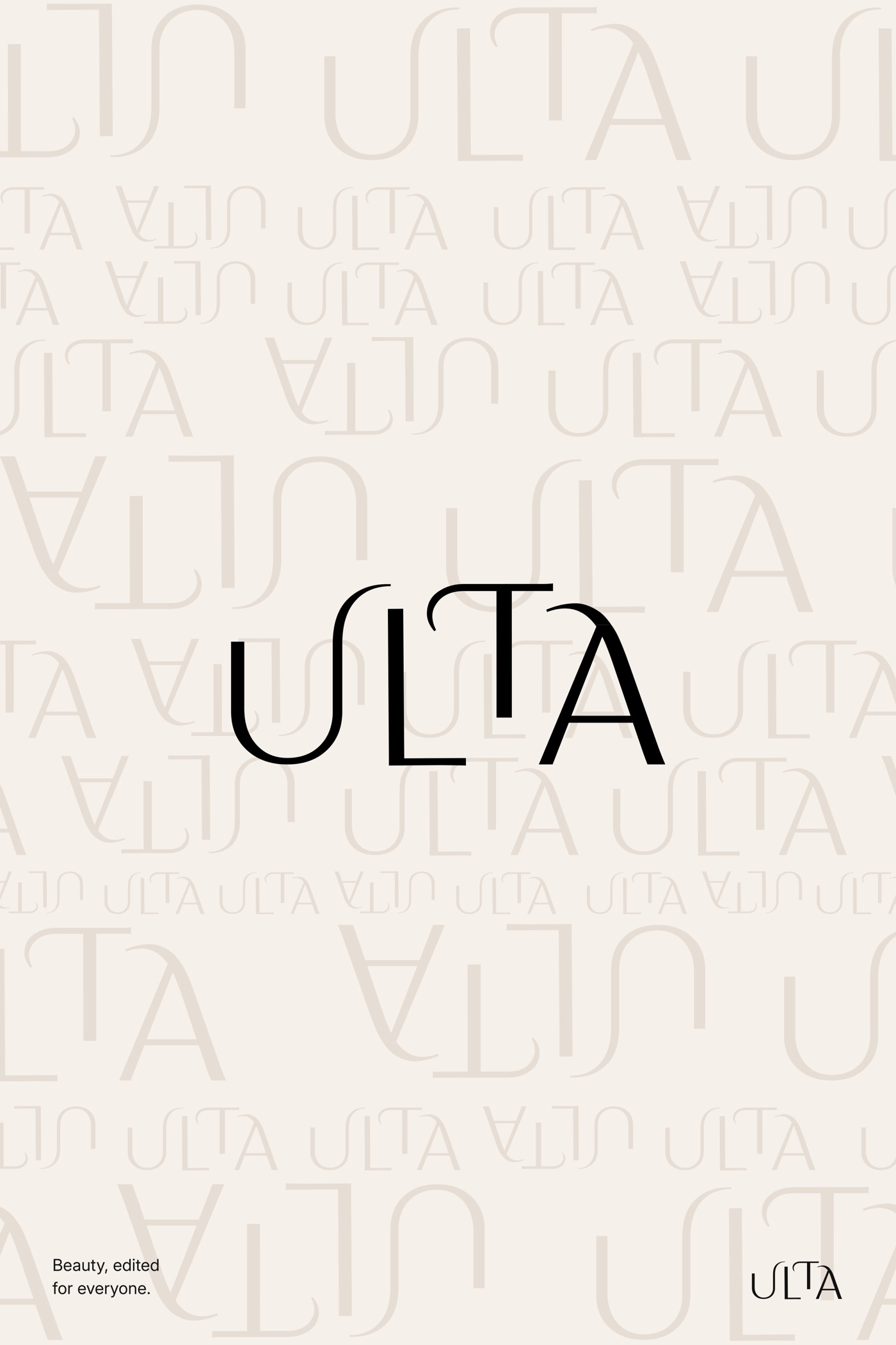
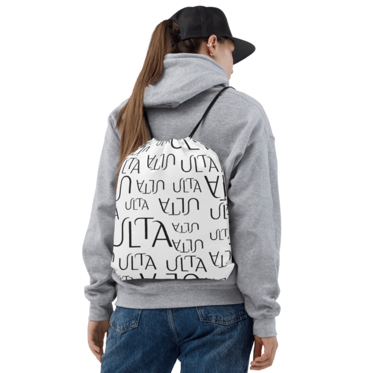
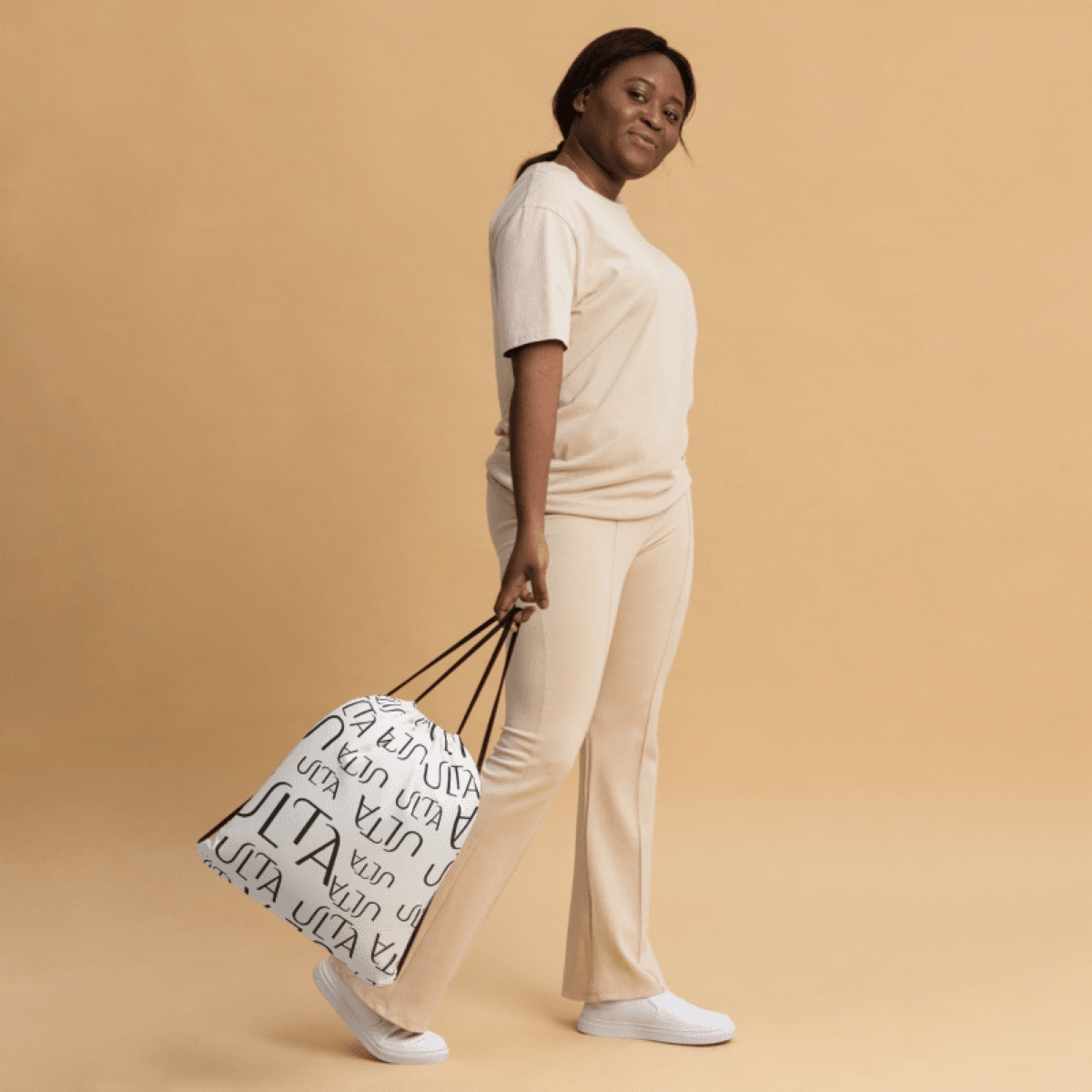
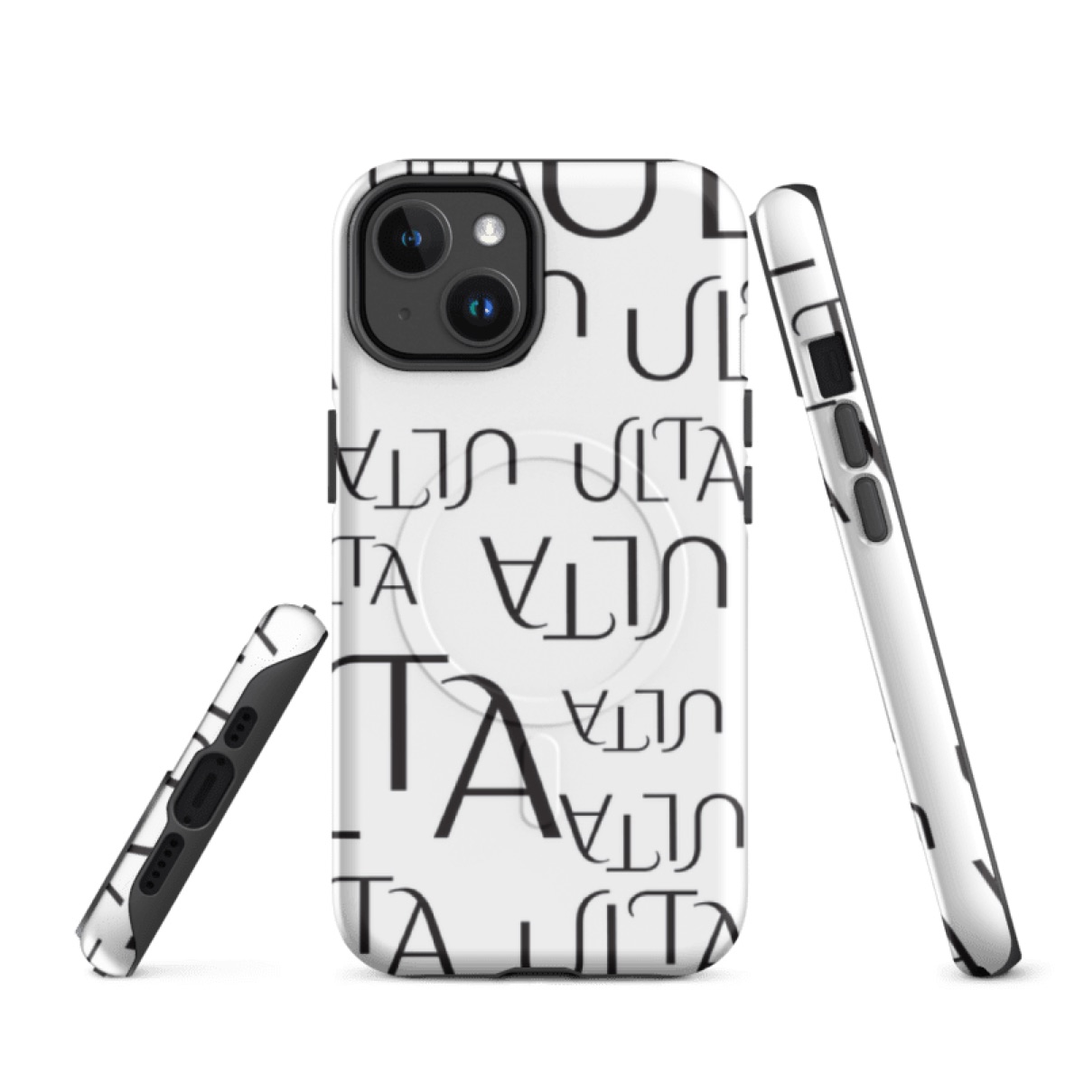
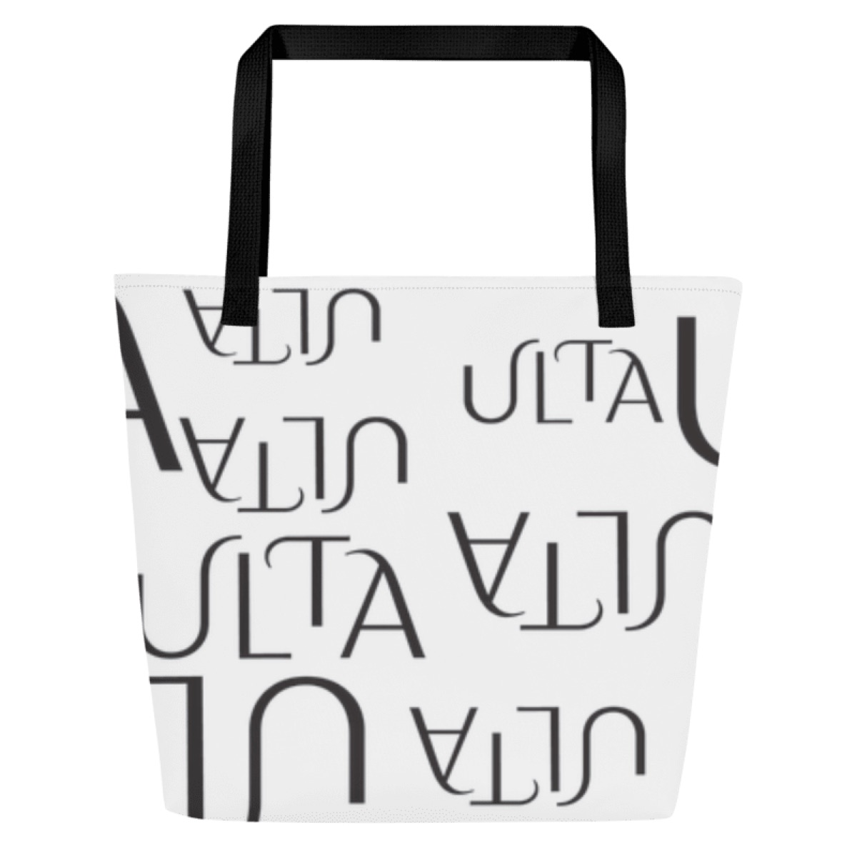
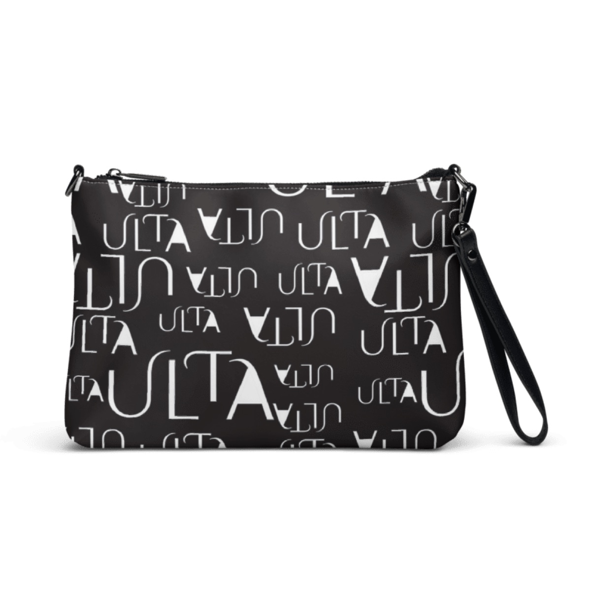
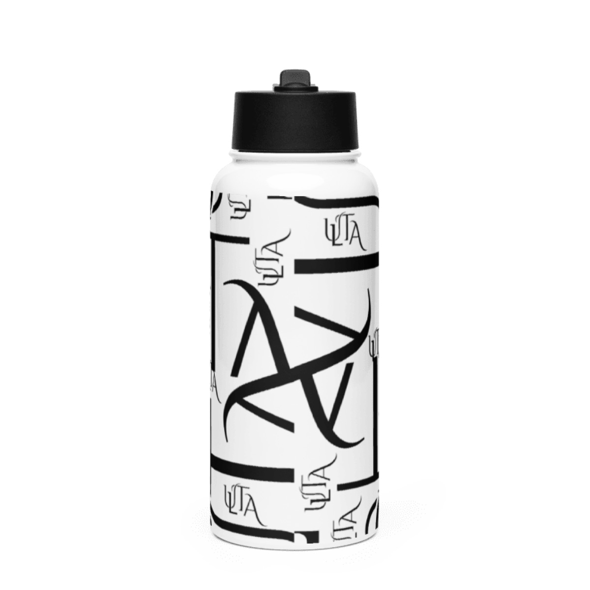
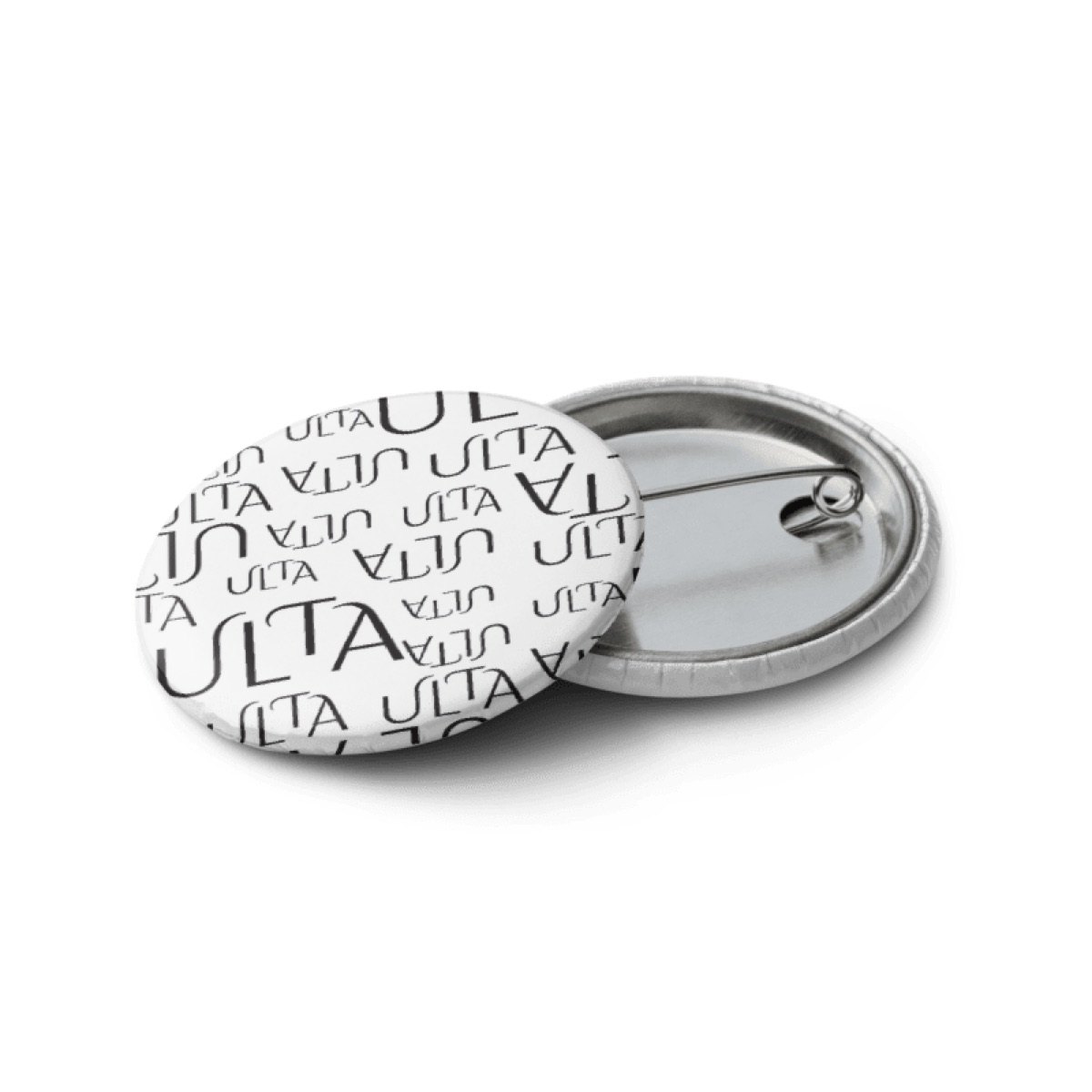
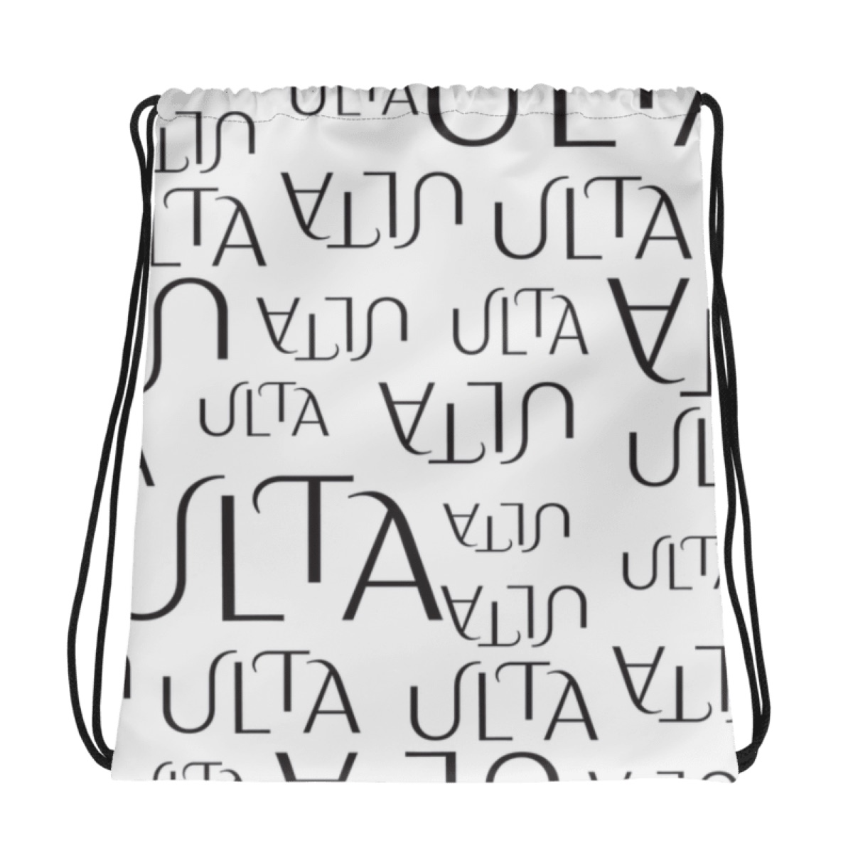
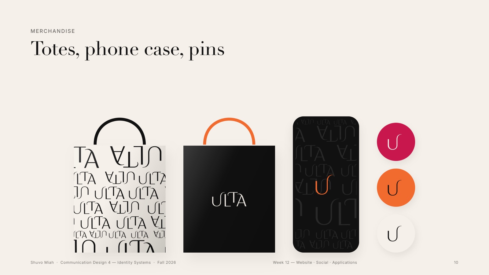
The pattern is the logo itself, at many sizes and turned upside down, so a bag or a box still reads as Ulta from across the store. Try it: every press makes a new arrangement, in the four moods of the system.
07Weeks 6–8 · Typographic behaviour
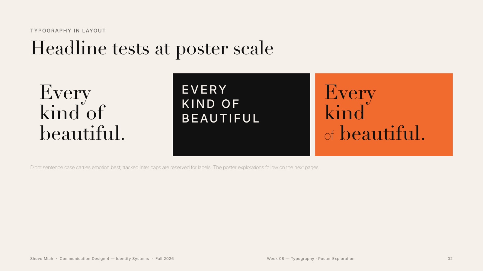
A classic voice and a clear one
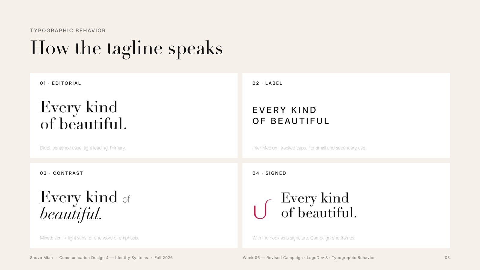
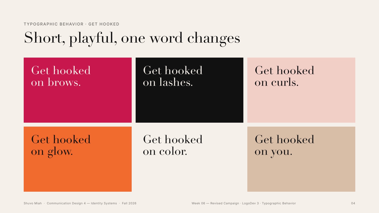
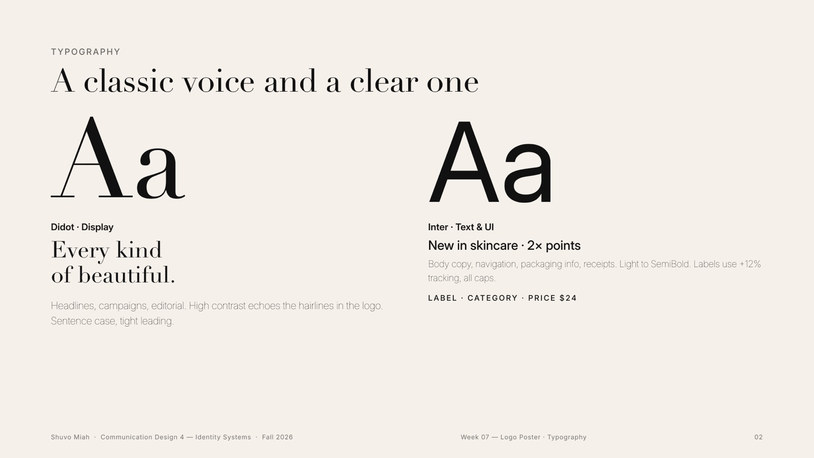
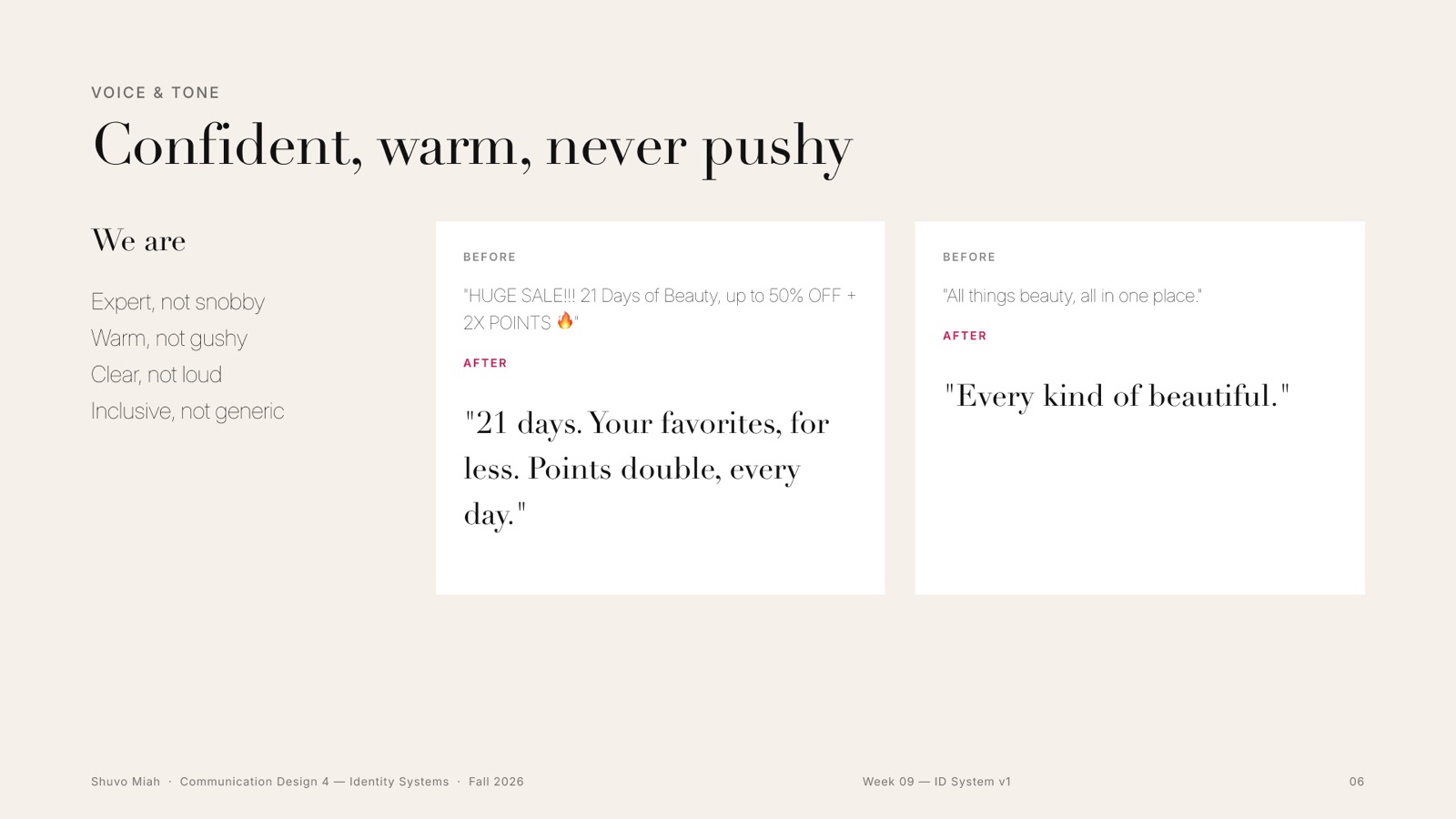
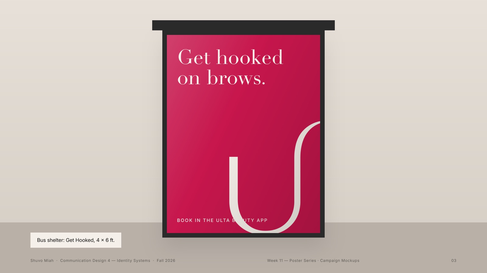
Didot echoes the hairlines of the logo and speaks in headlines; Inter does everything practical. Then the voice: confident, warm, never pushy. One line, “Get hooked on ___”, changes one word for every service. Tap it.
08Week 9 · Colour
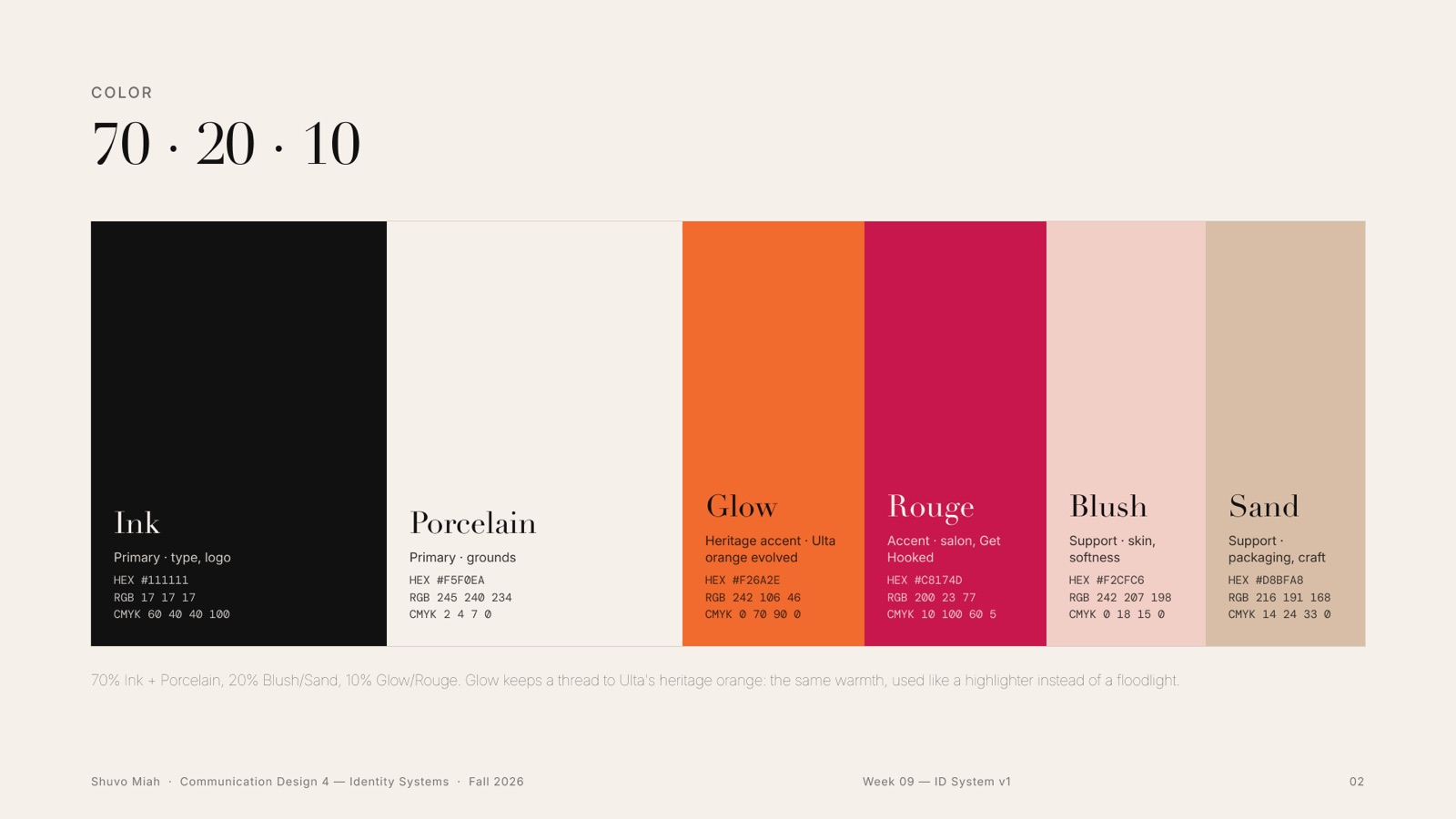
70 · 20 · 10
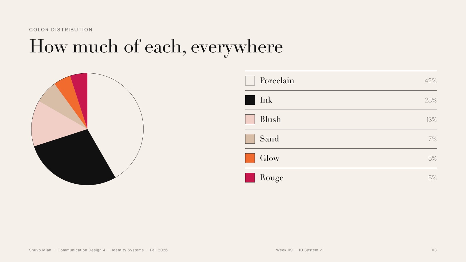
Seventy per cent Porcelain and Ink, twenty per cent soft support colours taken from skin and packaging, and ten per cent accent. Glow keeps Ulta’s orange alive, but as a highlight instead of a shout. Click a colour to copy it.
09Week 9 · Graphic device + photography
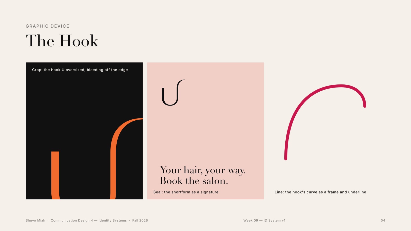
The Hook
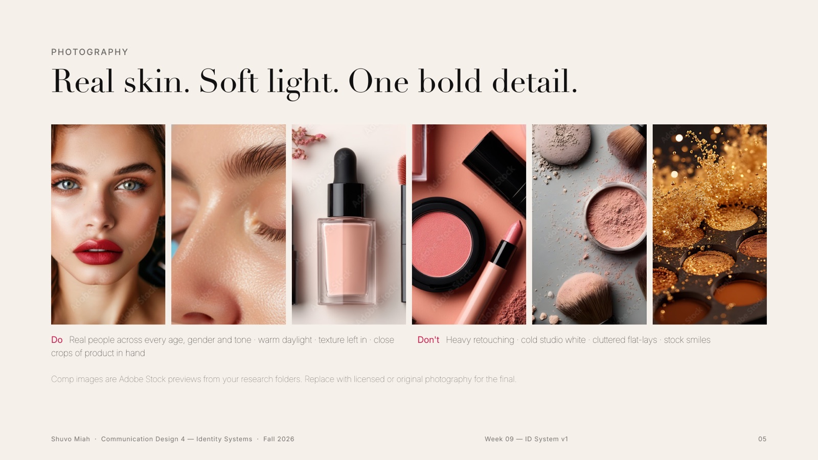
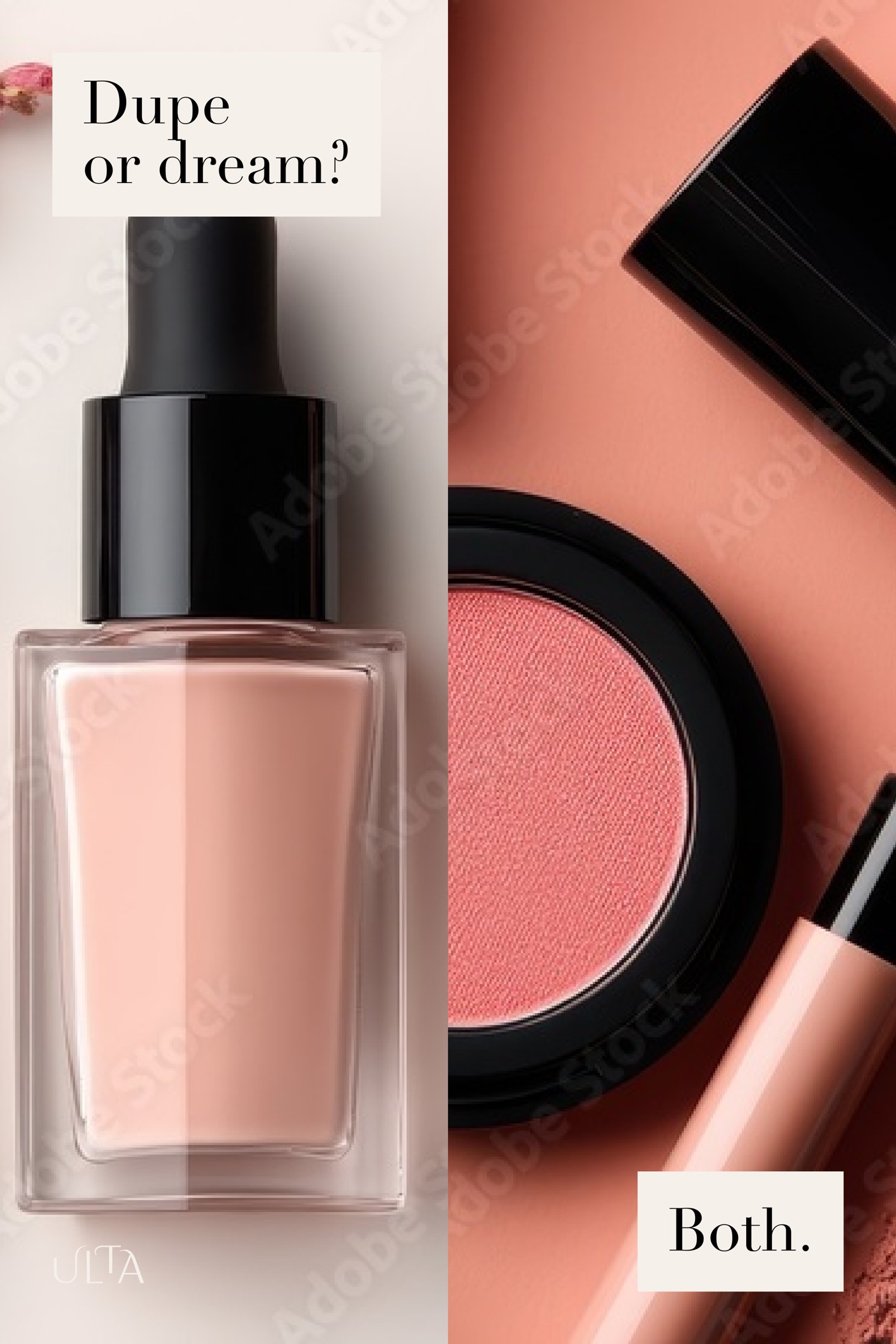
The hook crops, frames and underlines. Oversized, it bleeds off a poster; small, it signs a salon card. Photography follows one rule: real skin, soft light, one bold detail.
10Week 10 · Animation
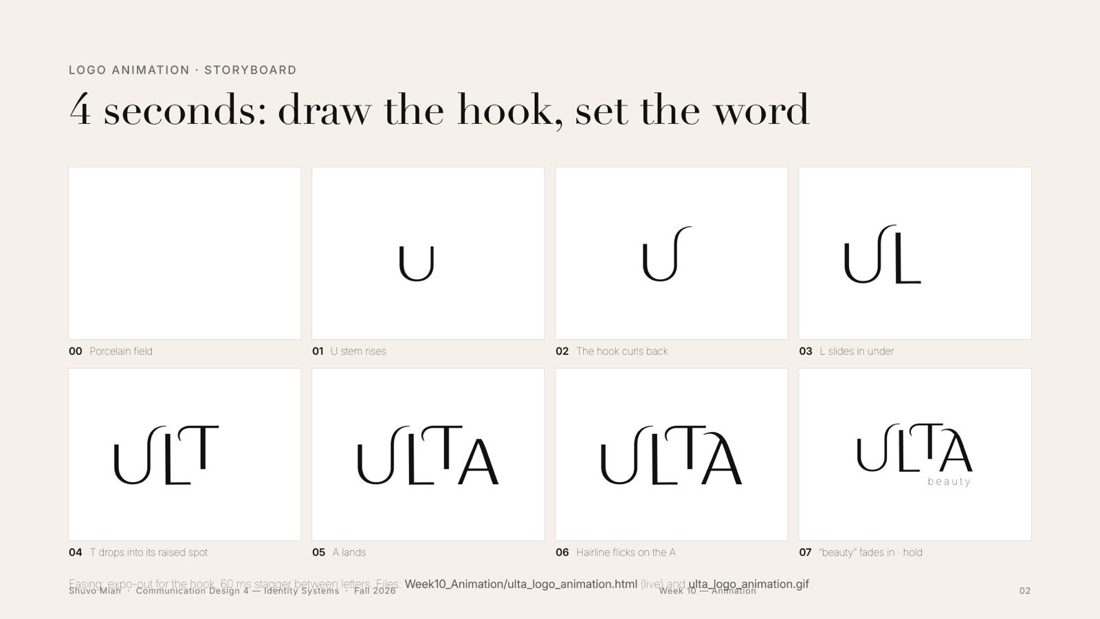
Four seconds: draw the hook, set the word
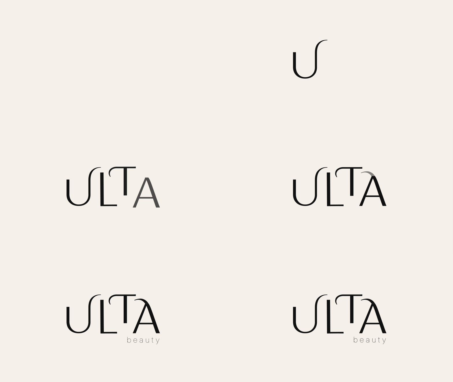
I storyboarded the logo before animating it: the U rises, the L slides in, the T drops, the A climbs, and the swash flicks on last. It is the same animation that opens this page.
11Weeks 5, 8 + 11 · Campaign
Every Kind of Beautiful × Get Hooked
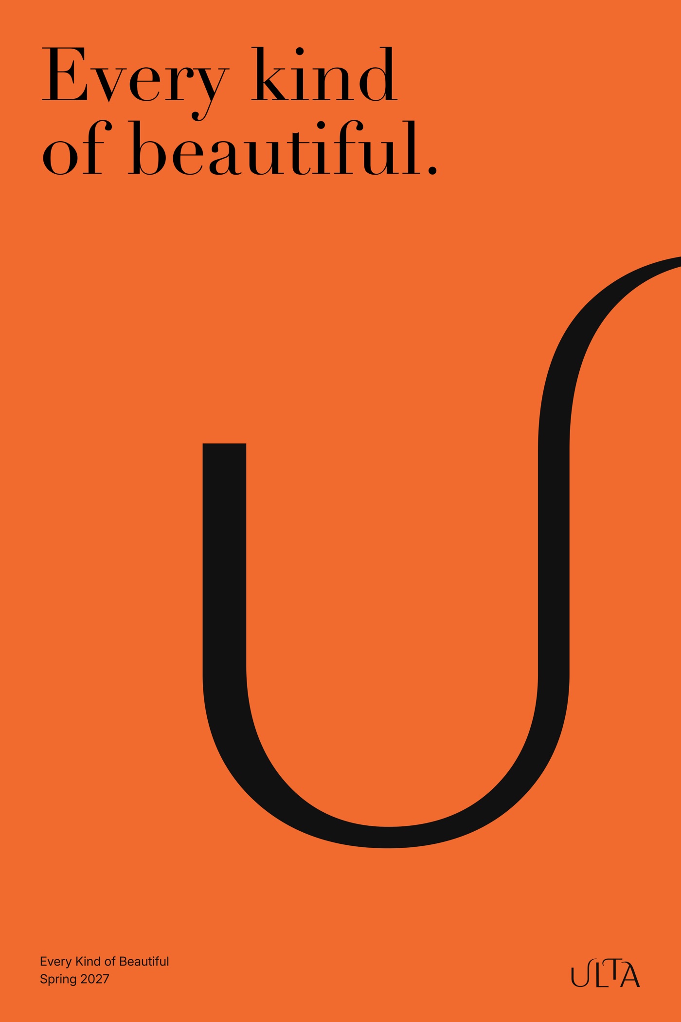
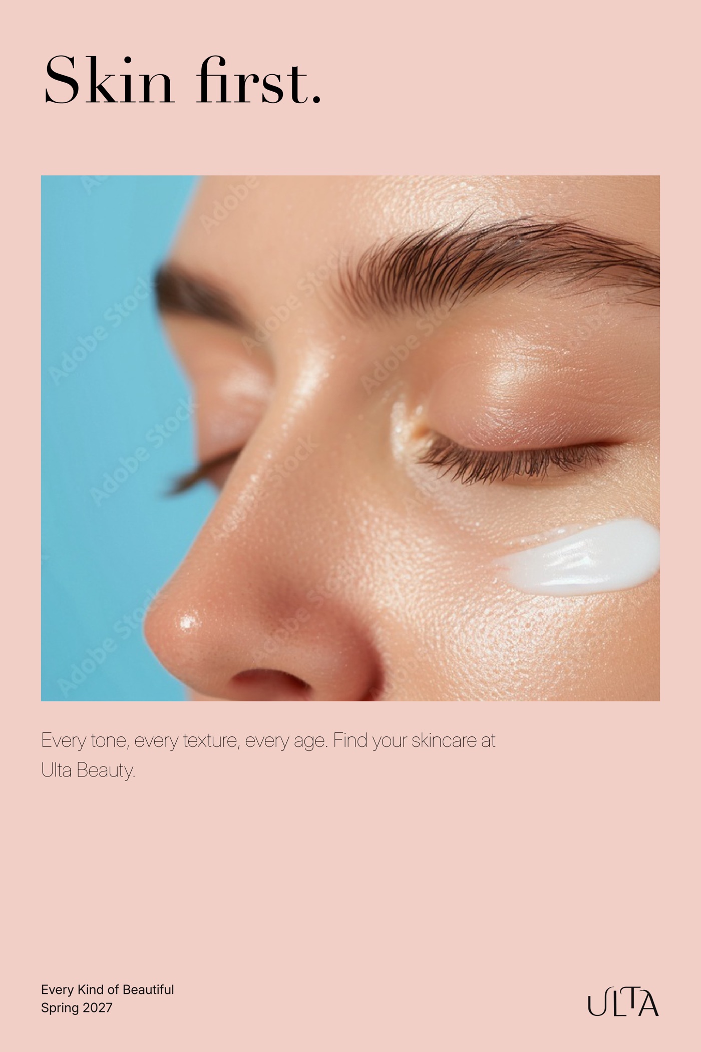
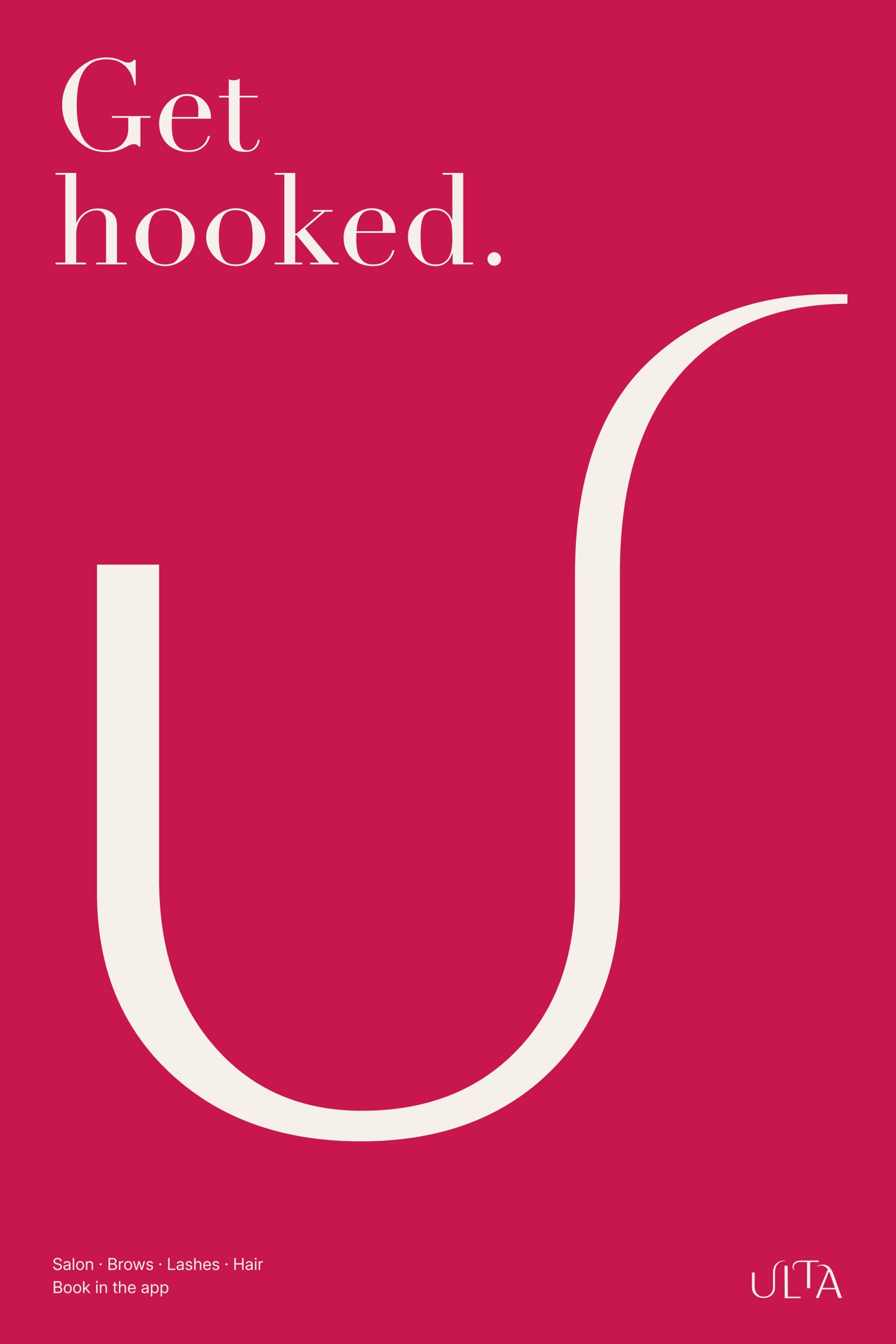
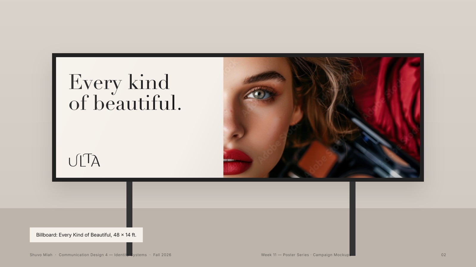
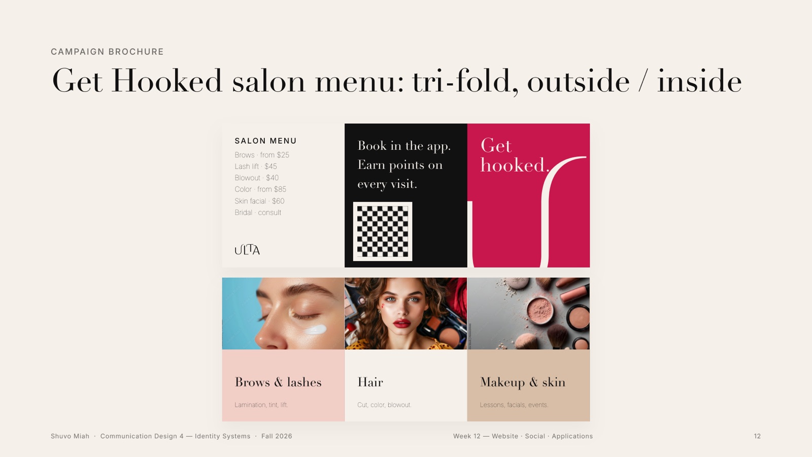
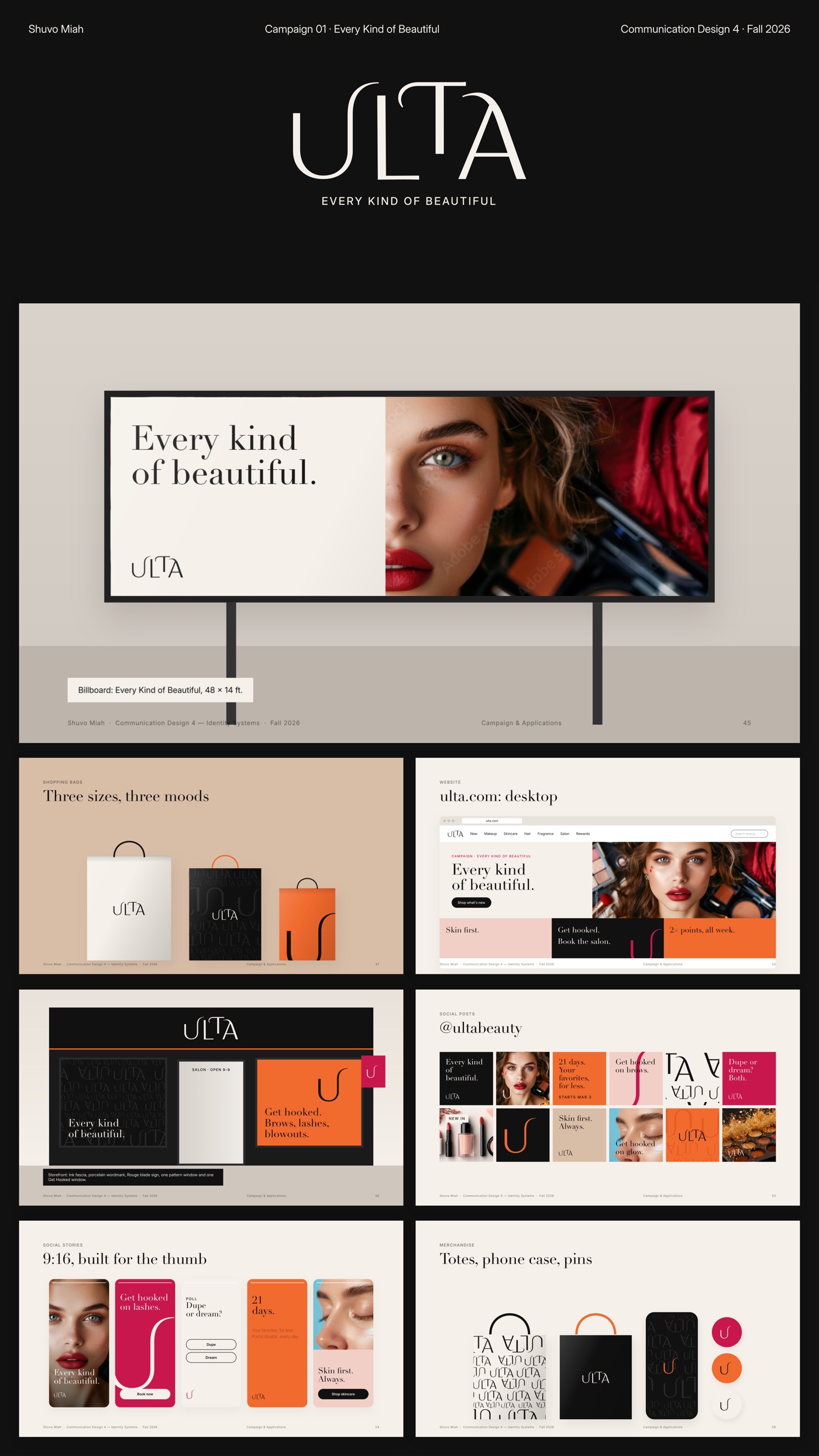
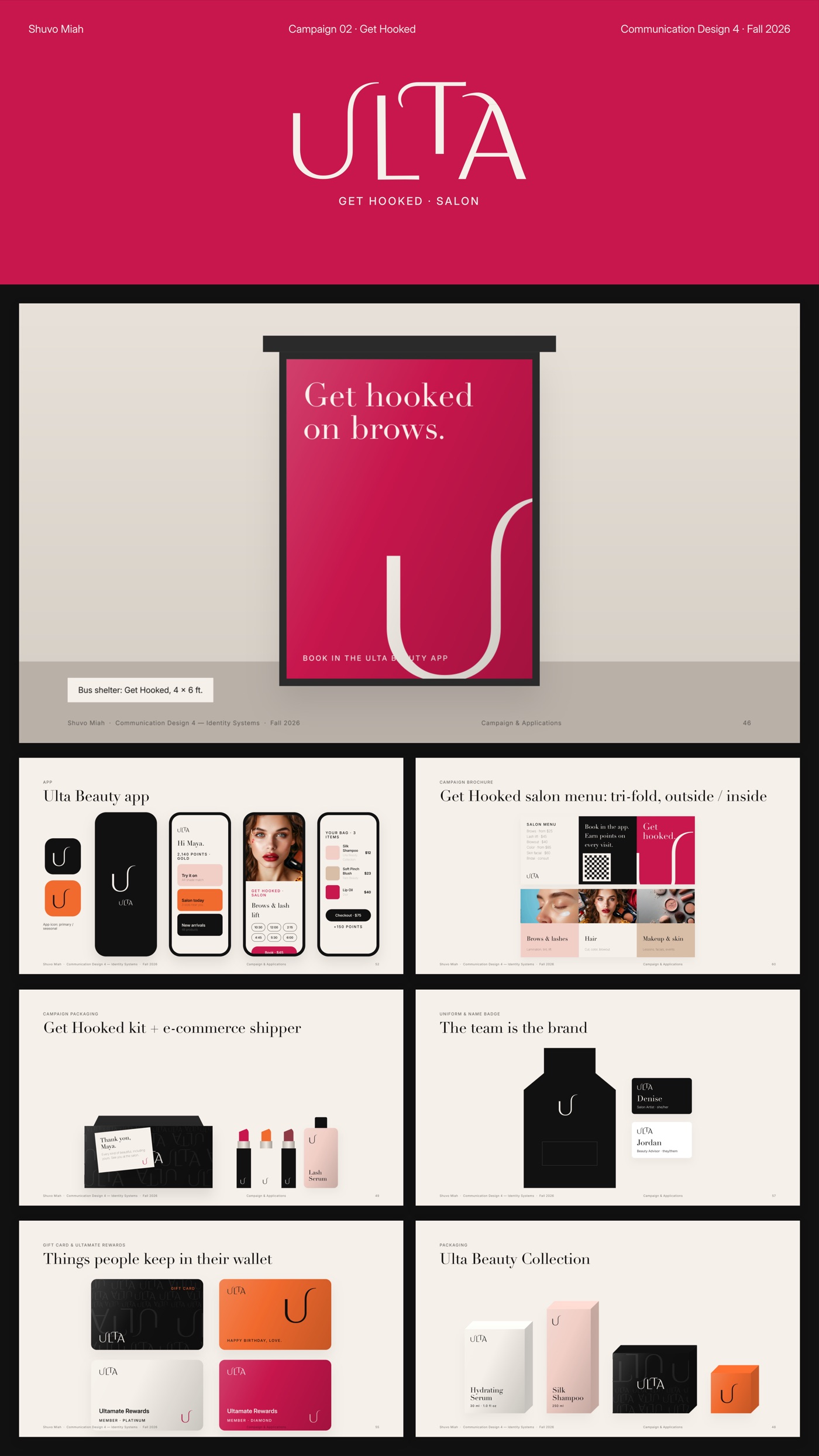
Two campaigns, one system. Every Kind of Beautiful speaks for the whole brand; Get Hooked sells the salon. I tested six poster directions at 24 × 36 before the final series of three, then took them outside: a billboard and a bus shelter.
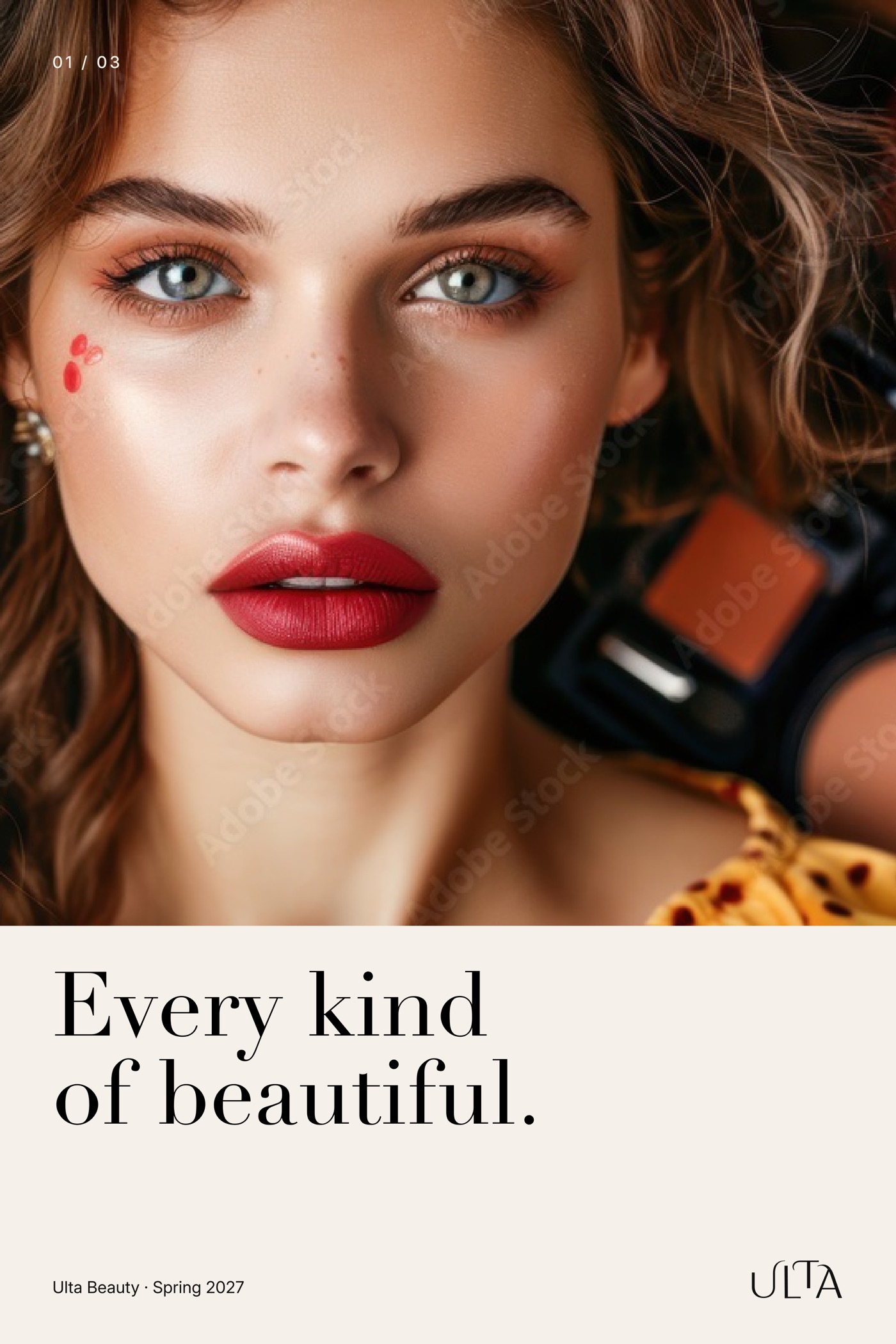
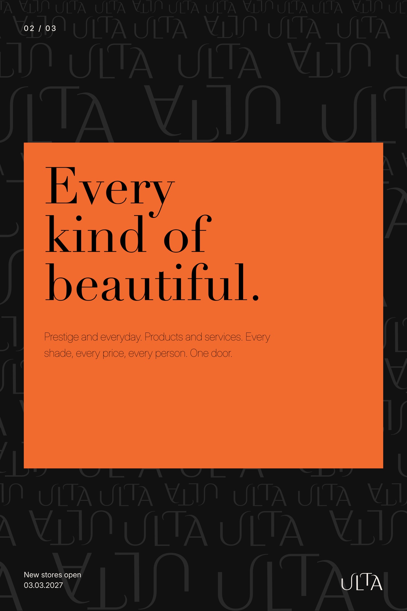
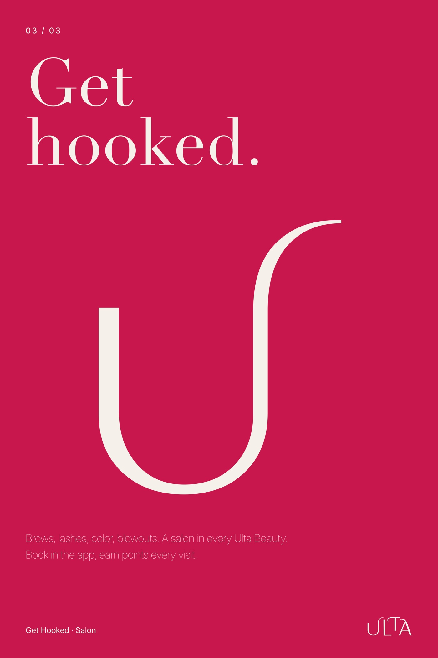
Six poster explorations · scroll →
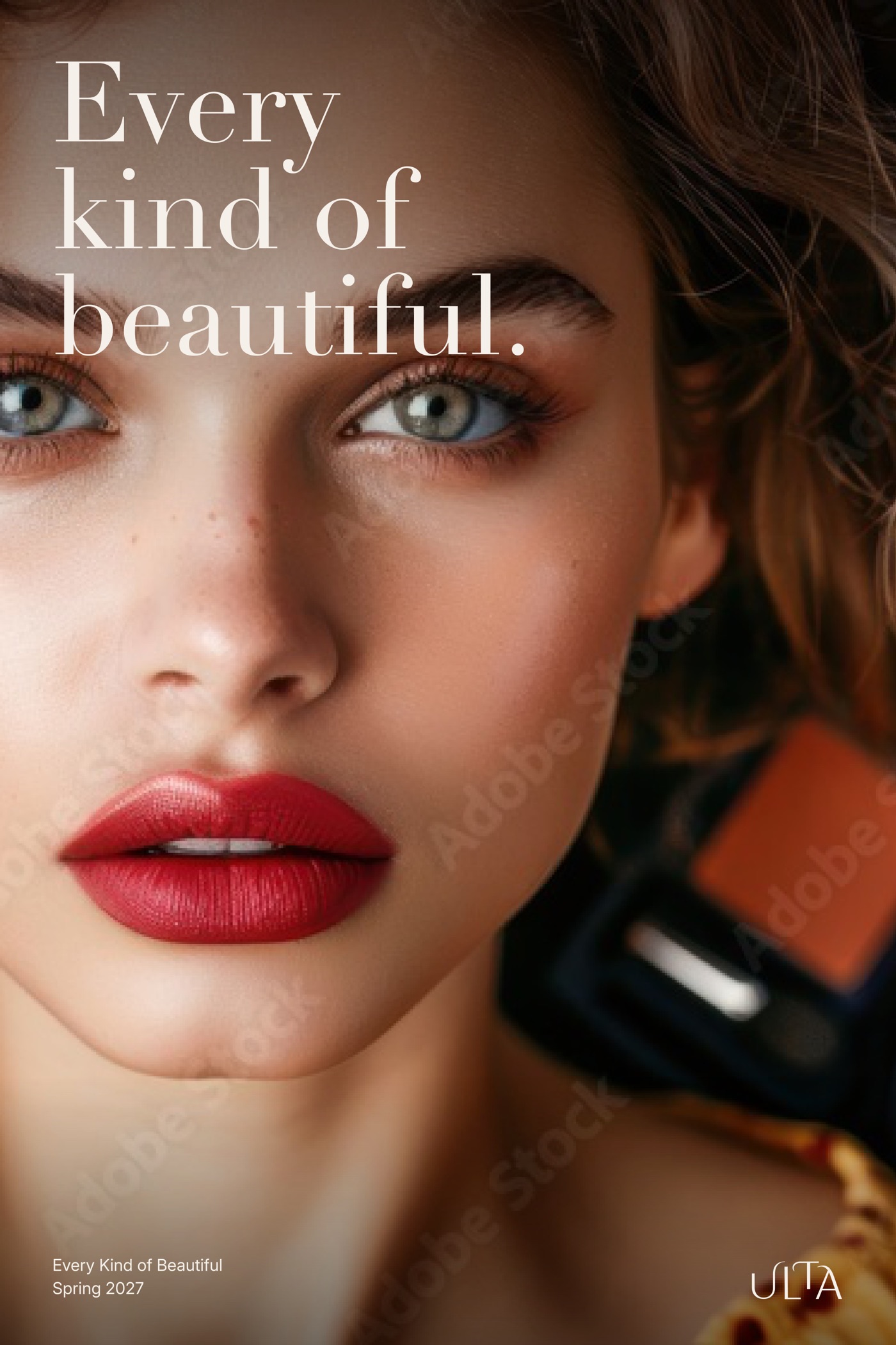
12Weeks 11–12 · Applications
Everything people touch
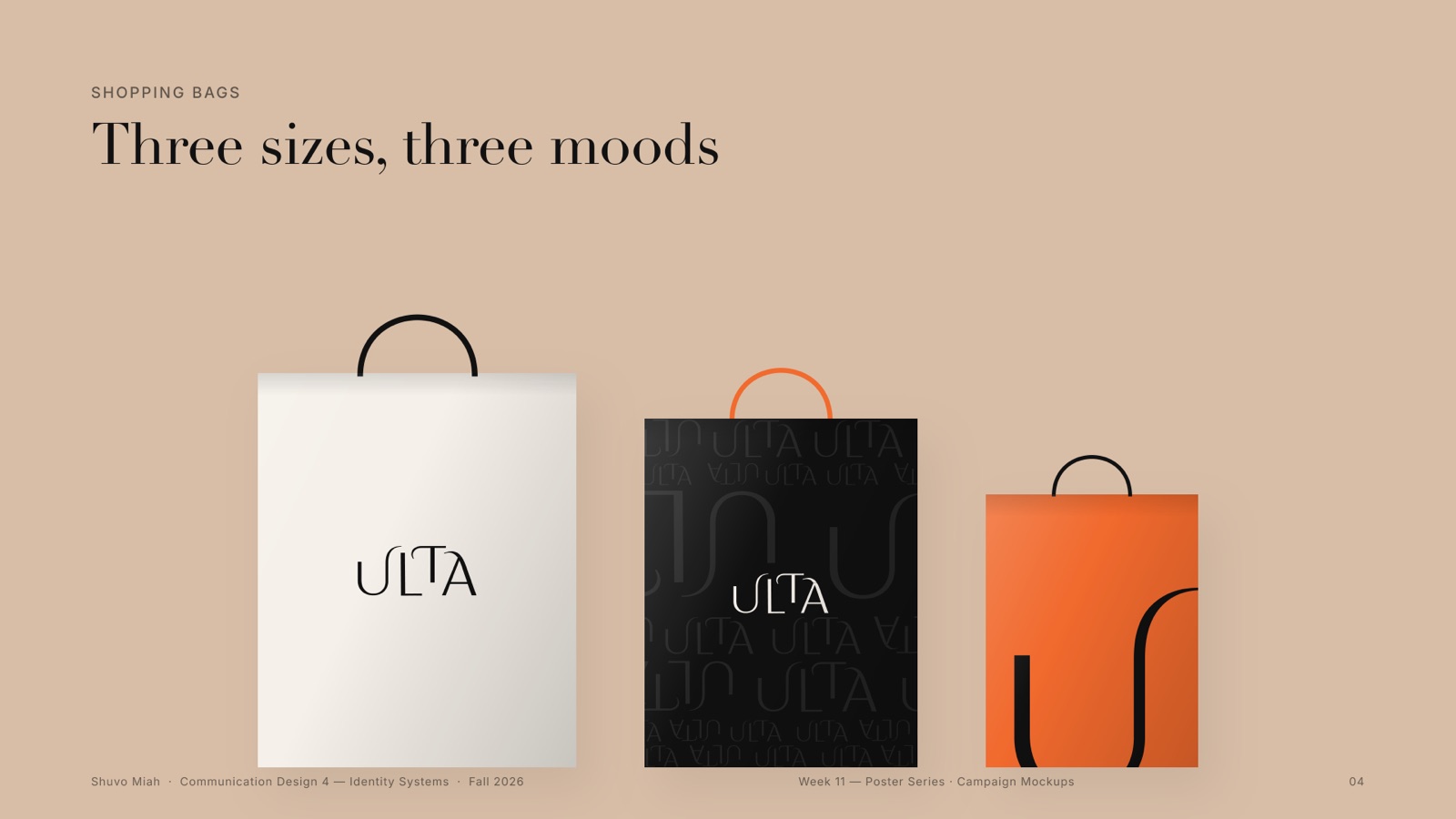
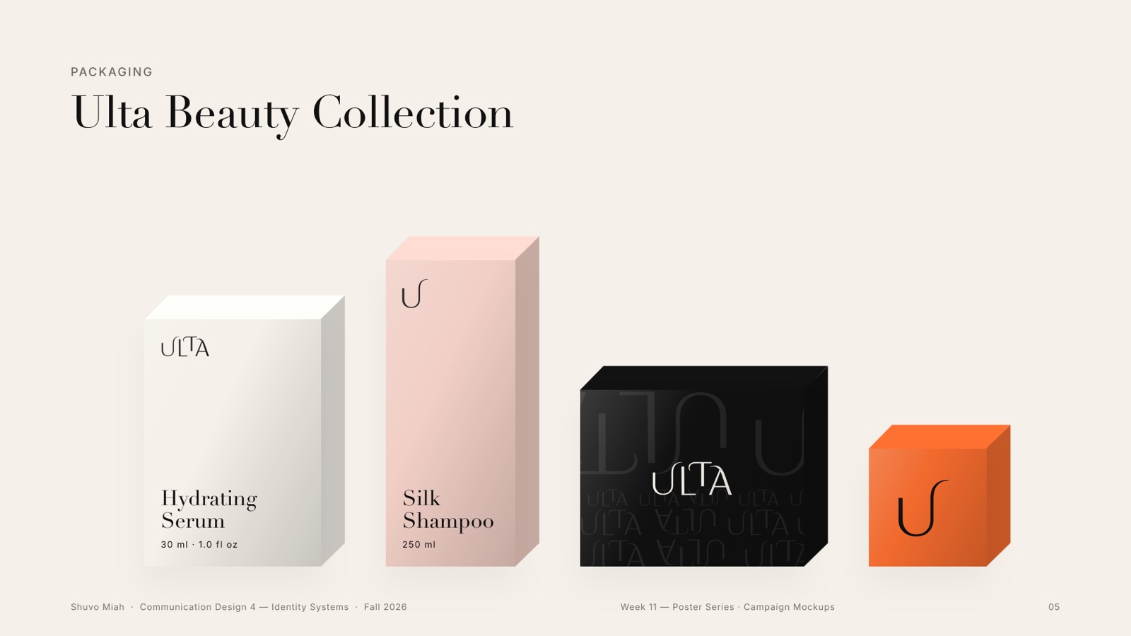
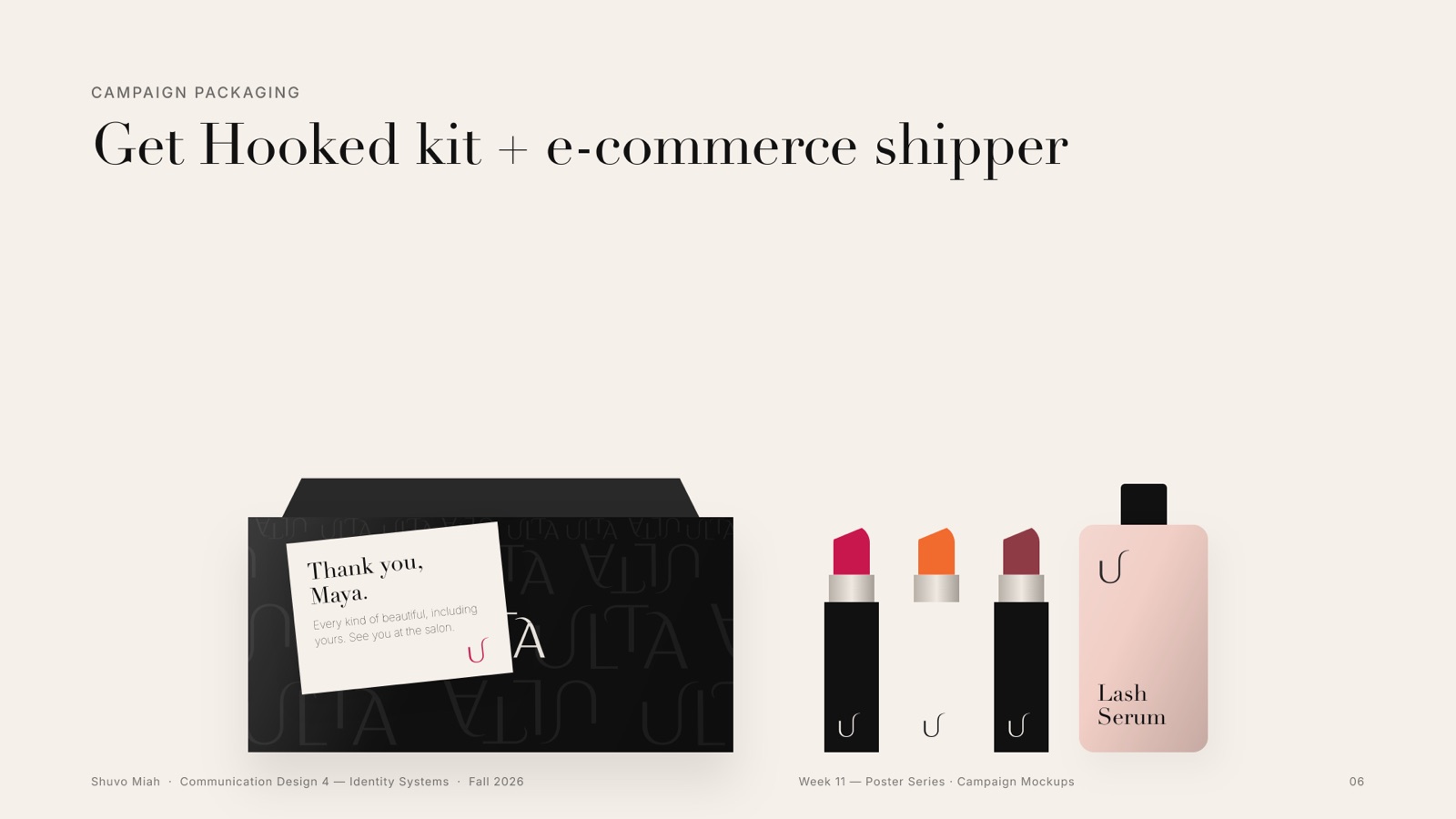
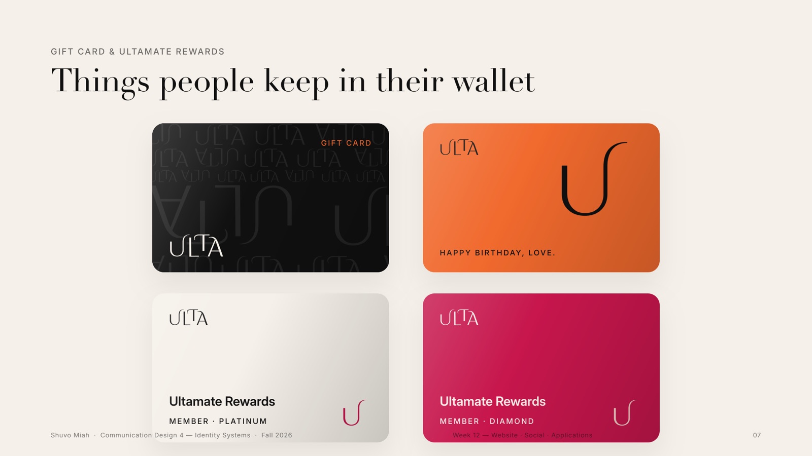
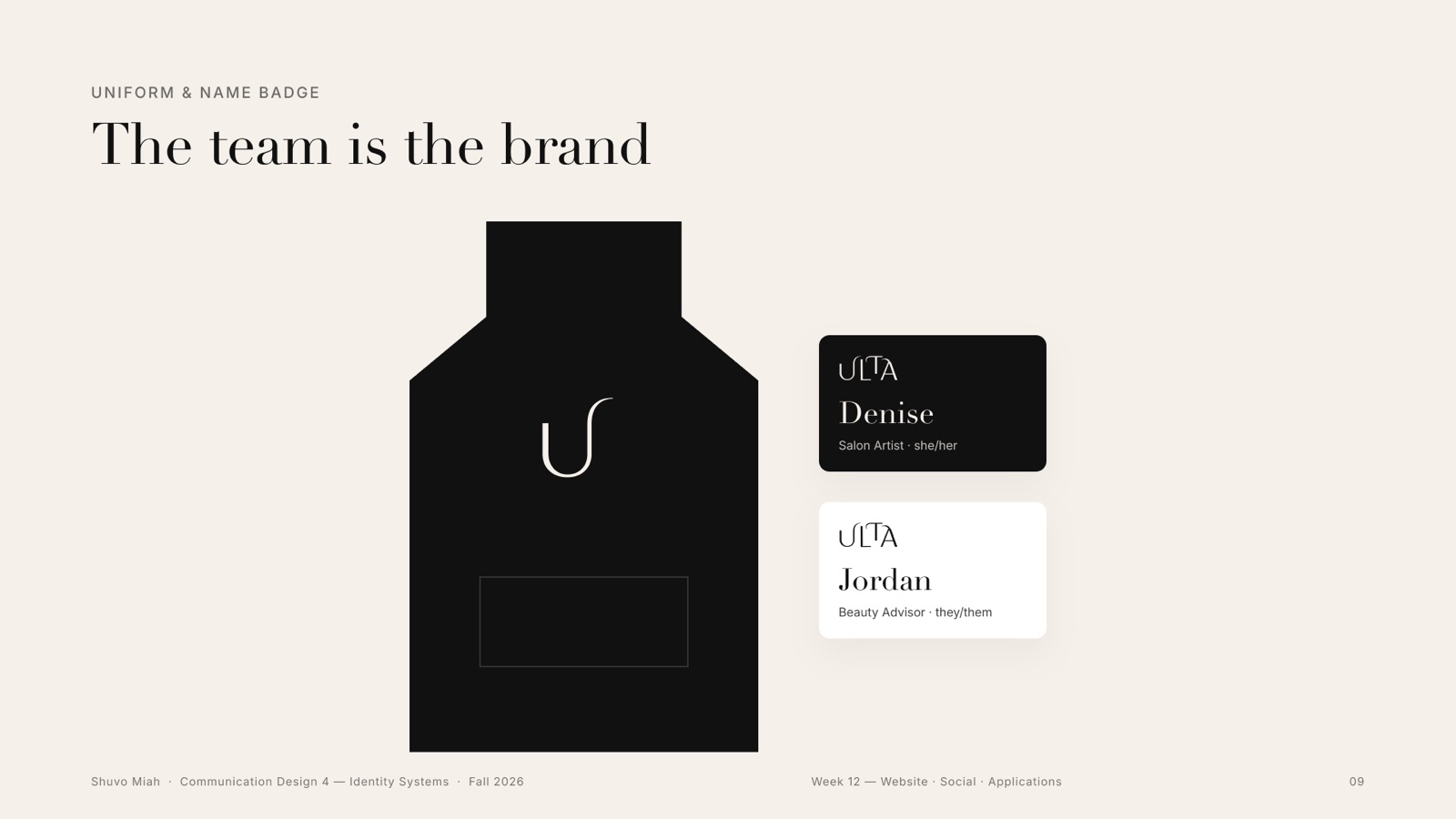
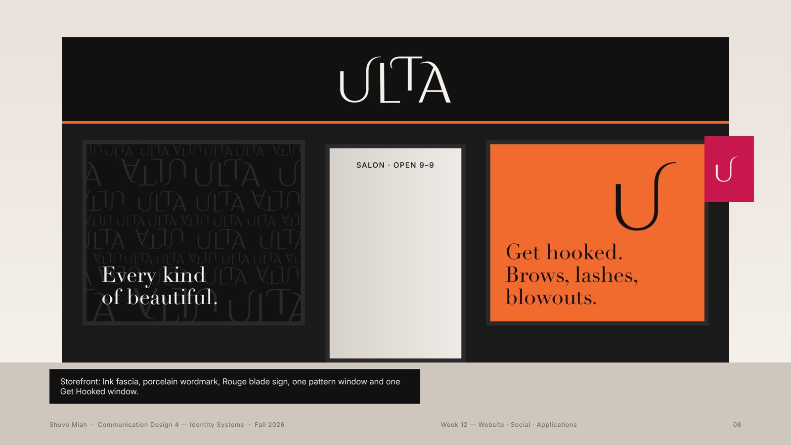
Shopping bags in three moods, product packaging, a Get Hooked kit and shipper, gift and Ultamate Rewards cards, the storefront, uniforms and name badges, and a tri-fold salon menu. And the pattern in the wild: my own merch mockups.
13Week 12 · Website, app + social
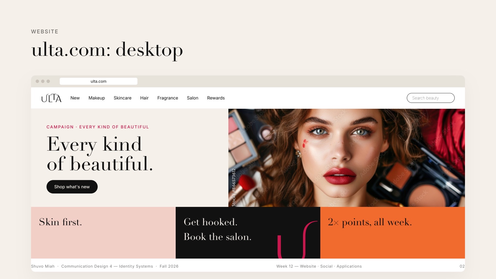
ulta.com, the app, and the feed
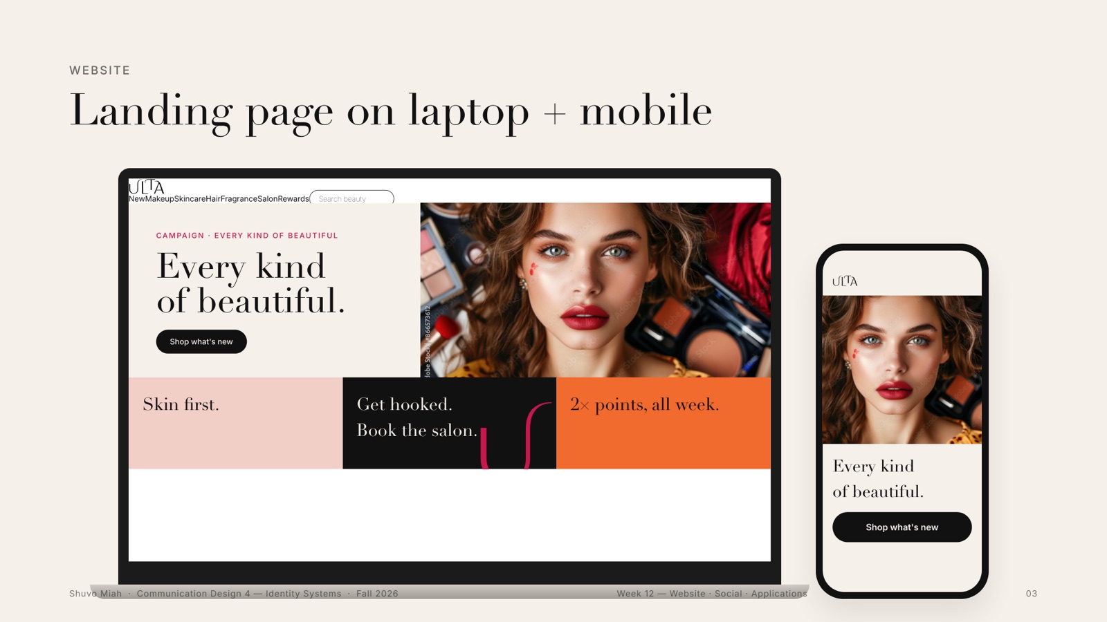
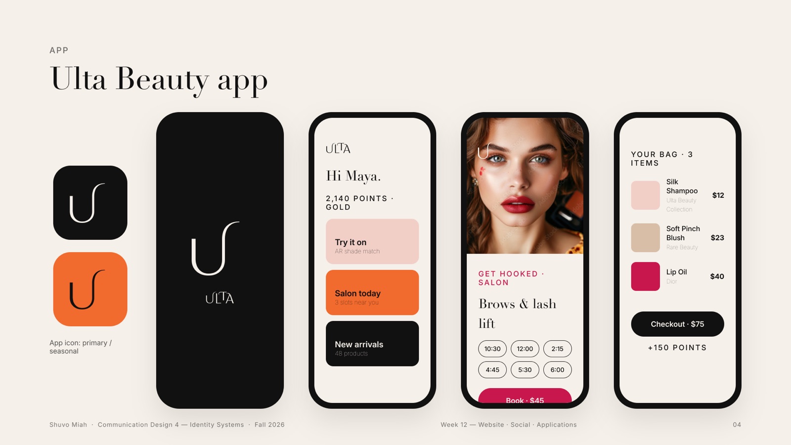
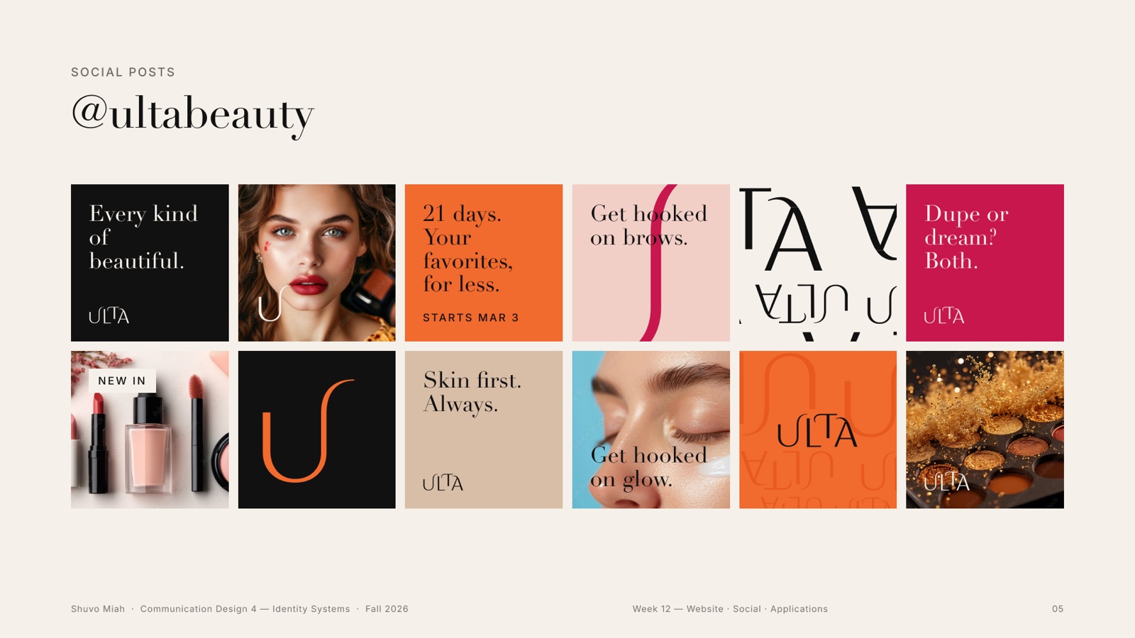
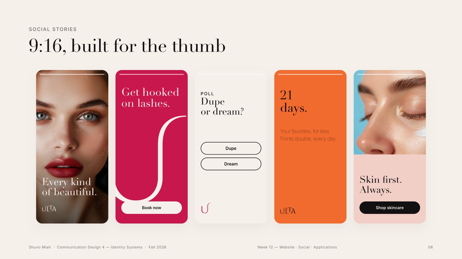
The landing page leads with the campaign, then three doors: skin, salon, points. The app turns the hook into its icon. On social, posts and 9:16 stories use the same one-word game as the posters.
14Weeks 12–13 · Final presentation
The show
Everything on one wall: the ID System board, the revised logo poster, and three tall show posters, each with the logo band on top and a grid of mockups below.
credits
- design
- Shuvo Miah
- class
- Communication Design 4 · Identity Systems, ArtCenter College of Design
- typefaces
- Didot, Inter
- note
- A student rebrand. Not affiliated with or endorsed by Ulta Beauty.